Redesign of a Vendor's Dashboard - BizMart

Project Overview
Task:
To evaluate the effectiveness and usability of the redesigned vendor dashboard interface. The goal was to simplify the user experience, improve accessibility to key metrics, and enhance overall navigation for vendors managing their e-commerce shops.
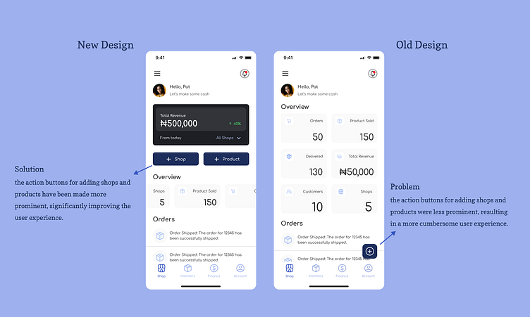
Old Design (Right):
Metrics and key information were scattered and less accessible.
Action buttons were less prominent, making it harder for vendors to quickly perform tasks.
New Design (Left):
Simplified layout with improved placement of key metrics.
Enhanced visibility of action buttons for adding shops and products.
Methodology
Comparison and Evaluation:
Overview Section:
Compared the placement and grouping of key metrics.
Evaluated clarity and accessibility improvements.
Action Buttons:
Assessed visibility and accessibility enhancements.
Determined ease of use.
Navigation and User Interactions:
*Examined overall navigation flow.
Assessed simplicity in user interaction and task performance.
User Feedback:
*
Conducted user testing sessions.
Gathered feedback on ease of use and efficiency in completing tasks.
Findings
1. Overview Section:
Old Design: Metrics were less accessible and scattered, making it hard for vendors to get a quick snapshot of their business.
New Design: Grouped metrics together, providing a clear and immediate overview. Vendors can quickly see total revenue, orders, products sold, and more, improving decision-making efficiency.
2. Action Buttons:
Old Design: "+ Shop" and "+ Product" buttons were less prominent and harder to locate.
New Design: Enhanced visibility of action buttons makes it easier for vendors to perform critical tasks like adding new shops or products. The placement directly under the total revenue box is intuitive and accessible.
3. Navigation and User Interaction:
Old Design: Navigation was less intuitive, with more steps required to perform common tasks.
New Design: Simplified navigation flow enhances user interaction. Vendors can quickly move between sections, improving overall efficiency.
4. User Feedback:
Positive: Users appreciated the simplified layout, clearer metrics, and more accessible action buttons. They found it easier to navigate and perform tasks.
Summary
Key Improvements:
Enhanced clarity and accessibility of key metrics
Improved visibility and usability of action buttons.
Simplified navigation and user interaction.
Impact on User Experience:
Vendors can now get a quick snapshot of their business performance, making informed decisions faster.
Performing tasks such as adding new shops or products is more intuitive and efficient.
Tracking and managing orders is significantly easier, reducing the time spent on these activities.
Recommendations for Further Enhancements:
Implement
quick links to frequently used functions.
Continue gathering user feedback for ongoing improvements.
Conclusion
The redesigned vendor dashboard interface significantly enhances the user experience by improving accessibility, clarity, and overall navigation. These changes are expected to increase vendor efficiency and satisfaction with the e-commerce app.
