REPLY 1973 | LOGO DESIGN & BRAND IDENTITY
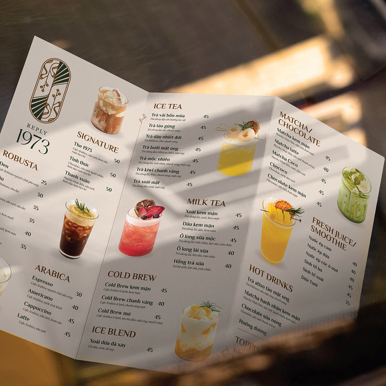
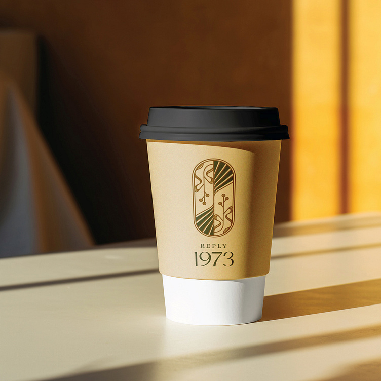
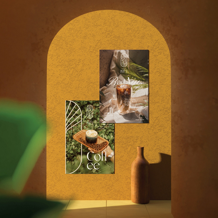
Reply 1973 offers customers a quiet and cozy atmosphere, reminiscent of old memories, recreating a part of the atmosphere of the 70s.
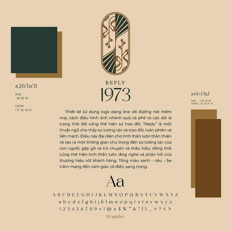
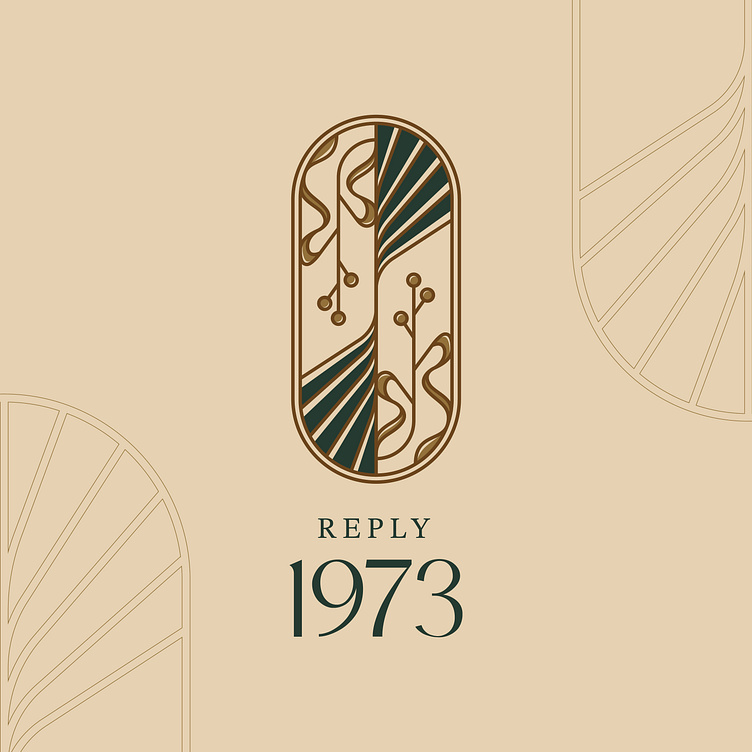
Under the echo of that old style, Bee Art has cleverly conveyed the brand story of Reply 1973 through the brand identity. With the main color tone of blue - brown - beige, the overall brand identity brings a warm, classic but no less luxurious feeling. The logo design of Reply 1973 is designed in the form of a line with soft lines, stylized images of coffee branches and symmetrical strips of leaves expressing exchange. "Reply" is a term that denotes seamless exchange and rotation. The symmetry in the design lines conveys the message of human interaction, encountering evil and understanding, and also expressing the brand's spirit of always listening and responding to customers.
Designed by Bee Art
-
Client Reply 1973
Logo and Branding Project. Logo is designed for a coffee brand in Vietnam.
Copyright © Bee Art. All Right Reserved
Contact us:
• Hotline/ Zalo: (+84) 77 34567 18
• Email: info@beeart.vn
• Website: www.beeart.vn
• Facebook: https://www.facebook.com/BeeArt.vn