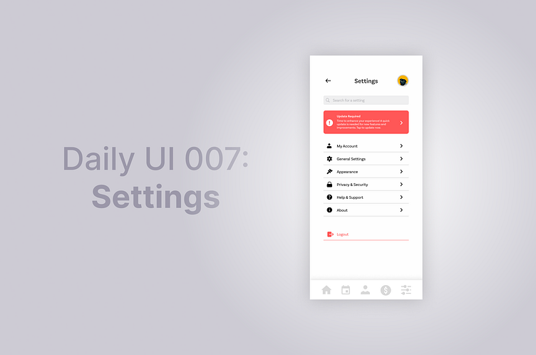
Daily UI 007: Settings
For this prompt I decided to keep it simple and straightforward, focusing mostly on being functional rather than making it look nice. It is a settings page for a generic mobile app. I then used a red colour as an accent colour, to highlight buttons/notifications that are important to the user (an important update for the app).
Would greatly appreciate feedback! #DailyUI
More by Grace Ho View profile
Like
