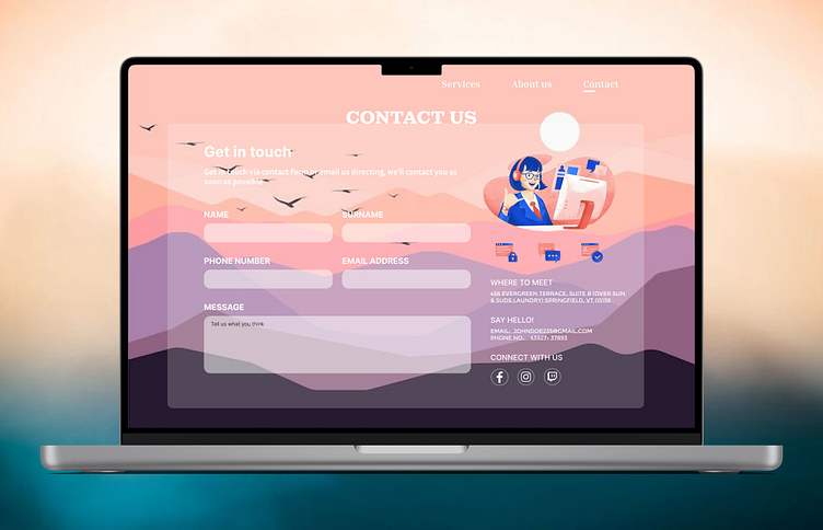
#Dailyui - 028
Conquered Day 28 of the #DailyUI Challenge!
This time, I tackled the design of a user-friendly contact form to bridge the gap between users and businesses. The focus? Streamlined communication! An intuitive layout with clear input fields makes it effortless for users to reach out. But it's not all about function - a touch of visual appeal with subtle branding creates a professional yet approachable atmosphere. And to cater to everyone's preferences, multiple contact options are offered, including email, phone, and even social media links. This design prioritizes user experience by simplifying communication and offering flexibility. Let me know in the comments what you think of this approach to contact forms!
My Social handles :-
#100DaysChallenge #ContactUI #UXDesign #UserExperience #BridgeTheGap #DailyUInspiration
