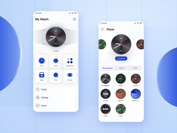
Watch Manager Mobile App
I use Galaxy wearable app to manage my galaxy watch and often felt that it is plain and boring. There is a lot of space wasted in the landing space which gives the impression that this app was created just to fulfill the watch management need of the user rather than giving him a good experience.
Therefore, I tried to explore a more intuitive and visually appealing experience however I chose to keep it generic in terms of branding.
Let me know what you think.
Dark mode
More by Kuldeep Sharma View profile
Like


