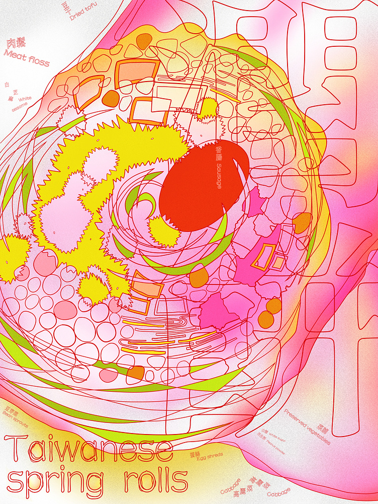
Taiwan Specialty Poster: Runbing (Taiwanese Spring Roll)
Reason for Selection:
During the time I was making the poster, I had a strong craving for runbing. When thinking about a theme, I realized that runbing perfectly embodies a part of Taiwan's culinary culture.
Concept/Process:
The idea is to highlight the large and stuffed interior of the runbing, but without fully coloring the entire roll to avoid making the image too chaotic.
Instead, specific ingredients are marked with colors to indicate their presence.
The overlapping and non-overlapping lines enhance the effect of a full and somewhat messy filling.
Considering that Taiwan's signage often features high saturation and vivid colors, but knowing that CMYK printing can't fully achieve such saturation, I used contrasting methods to create the illusion of high saturation in the printed poster.
選擇原因:
做海報那時非常想吃潤餅,在想主題時也聯想到了潤餅符合臺灣飲食文化的一種。
概念/過程:
想突顯潤餅大又滿的內餡,但填色上又不想把整個潤餅塗好塗滿讓畫面過於雜亂,所以改以顏色標註出部份內容物。 線條的重疊和非重疊,增加內餡更為飽滿雜亂的效果。 顏色上想到了臺灣招牌一直都以高飽和高彩度,但CMYK印刷無法呈現高飽和,因而使用對比的方式,將印製出的海報形成高彩的錯覺。
