Travel Company Landing Page Design For Wanderlust!
Travel Company Landing Page Design For Wanderlust!
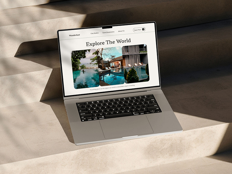
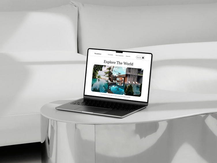
Creating a compelling landing page for Wanderlust a travel company is more than just an exercise in aesthetics; it requires a deep understanding of user behavior, market trends, and technological advancements. Our research aimed to design a landing page that not only captivates visitors but also converts them into customers. Here's a glimpse into the research and development process that went into crafting an effective landing page for a travel company.
Key Findings:
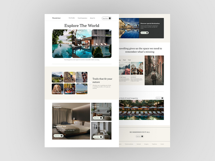
1. Visual Appeal and Imagery
High-quality images and videos of travel destinations significantly enhance user engagement.
Visual storytelling through photo galleries and virtual tours was highly effective in capturing user interest.
2. Clear Call-to-Actions (CTAs)
Prominent and well-placed CTAs such as "Book Now," "Explore Destinations," and "Get a Quote" led to higher conversion rates.
3. User-Friendly Navigation
A sticky header with quick access to essential links was favored by users.
4. Trust and Credibility
Displaying customer reviews, testimonials, and trust badges, secure payment icons, boosted user confidence.
The design of the travel company's landing page is a result of meticulous research and user-centered design principles. By focusing on visual appeal, clear navigation, personalized content, and trust-building elements, we created a landing page that not only attracts visitors but also converts them into loyal customers.
Thanks for watching!
For Business Inquiry: contactsakibreza@gmail.com
WhatsApp: +088 01968260053
Follow Me On:
