Coinecto Brand Identity
Coinecto
Seamlessly manage, securely transact, and explore endless financial possibilities.
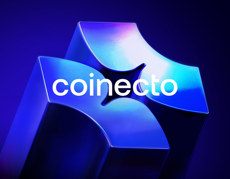
The design cleverly incorporates the letter C, adding a personal touch and subtly nodding to the word "coin" within Coinecto, reinforcing its core focus on currency management. Meanwhile, the entwined quarter circles signify unity in diverse financial elements, echoing the interconnected nature of various financial transactions facilitated by Coinecto.
The subtle spark at the center not only symbolizes dynamic energy and growth potential but also subtly alludes to the idea of a valuable coin, further emphasizing the platform's dedication to maximizing financial opportunities for its users. Deliberate choices in each curve and connection reflect Coinecto's commitment to sophistication, accessibility, and seamless financial operations.


