Brand Identity - Red5
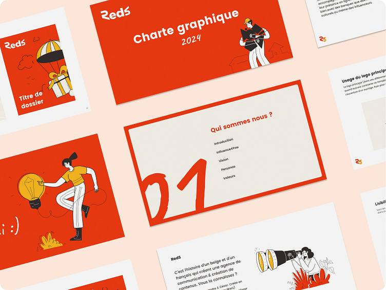
For Red5, a dynamic communication agency, I crafted a distinctive brand identity that encapsulates their kind spirit and people-oriented customer approach.
The agency's name being Red5, we needed to keep red as the dominant color in the palette. We did not want an aggressive or violent red, which would have been very far from the agency's core values.
Inspired by an American diner, where people meet around a good cup of coffee, the color palette has that warm retro vibe. I worked on a vibrant reddish-orange, dynamic and punchy, and colorful shades to go with it, including a faded yellow and soft pinks.
I also worked on a whole new take on their logo. The R and the 5 are mirrored and turned upside down. It emphasizes the agency's motto of helping brands do a 180-degree turn in their online strategies.
Eventually, I added hand-drawn shapes and doodles, as well as illustrations. They help humanize Red5 and give it a friendly image. Their strokes are imperfect, which emphasizes Red5 humanity.
Landing & "our clients" page
UI Kit
I gave Red5 a Brand Book and a Ui Kit. The Ui Kit is a shortened Brand Book, where you can see the important informations at one glimpse. It's easier to browse when you just need a color reference for example.


