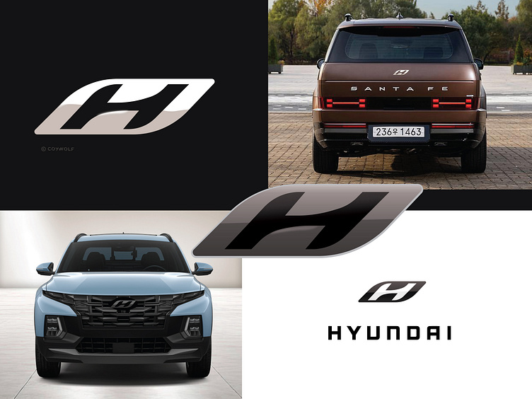
Proposed - Hyundai Motor Company Logo
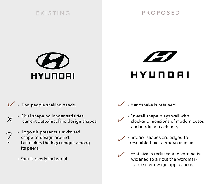
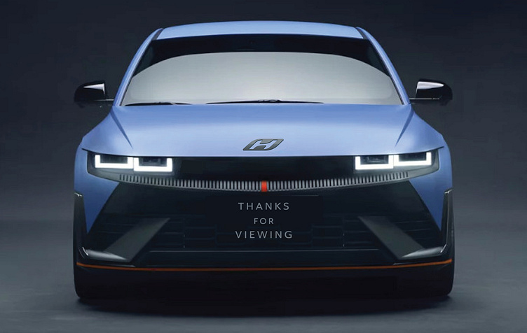
Hyundai Motor Company has been using the italic H oval logo for 2 decades and it served them well to define their customer first value promise. Today however, the logo no longer works as well, because the chaotic and overly fancy forms and overal aesthetic are at odds with the shapes and trends of the automotive industry in 2024. The South Korean car giant now produces vehicles in every price range and style imaginable, so I took it upon myself to propose a new badge that sits much better across the entire suite of vehicles offered.
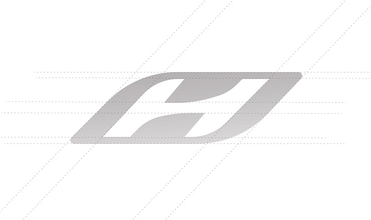
Since it is not a shape that is present anywhere on dashboards or car body panels, the oval is out - replaced with an italiized rectangle that continues to make the brand unique among its peers. An upright H could work, however that would put them in competition with Honda's H logo. The existing Hyundai bage depicts a customer shaking hands with a retailer. This element is valuable because value and competitive fairness remains a core principle at Hyundai.
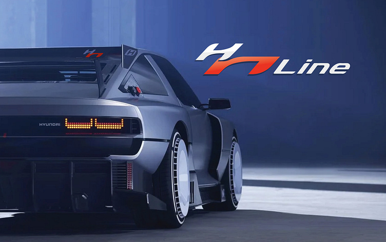
A versatile mark with shapes that can spin off into the sport tuned lines of vehicles like N-Line.
A new identity system, worthy of a car company that is always pushing forward to what is next and what is better.
Questions?
e: logoturn@gmail.com
