Rebranding the Rijksmuseum
About the Rijksmuseum
The Rijksmuseum in Amsterdam is a prominent art museum dedicated to Dutch art and history. It houses an extensive collection of paintings, sculptures, prints, historical objects and more from national and international artists. The brand promise of Rijksmuseum is to provide visitors with a comprehensive and immersive experience of art and history. The Rijksmuseum aims to cater to a diverse audience with varied backgrounds and interests. These include Art and History enthusiasts, Tourists, families and students. Currently, due its formal and simple aesthetic, the brand does not successfully connect to casual viewers who do not have a specific interest in Art or History as well as families and students.
The brand’s values centre around preserving cultural heritage, accessibility and innovation. At present, the brand expression does not align with these values and they need to be strongly emphasised in the redesign. The colour palette mainly consists of grey, black and red which is neither memorable nor distinct. The typeface appears dull and lacking in personality. The RijksMuseum faces competition from many other famous cultural institutions around the world, such as the Museum of Modern Art, whose brand identity is engaging and exciting due to consistent use of visual elements that represent their bold, fearless aesthetic.

Concept statement
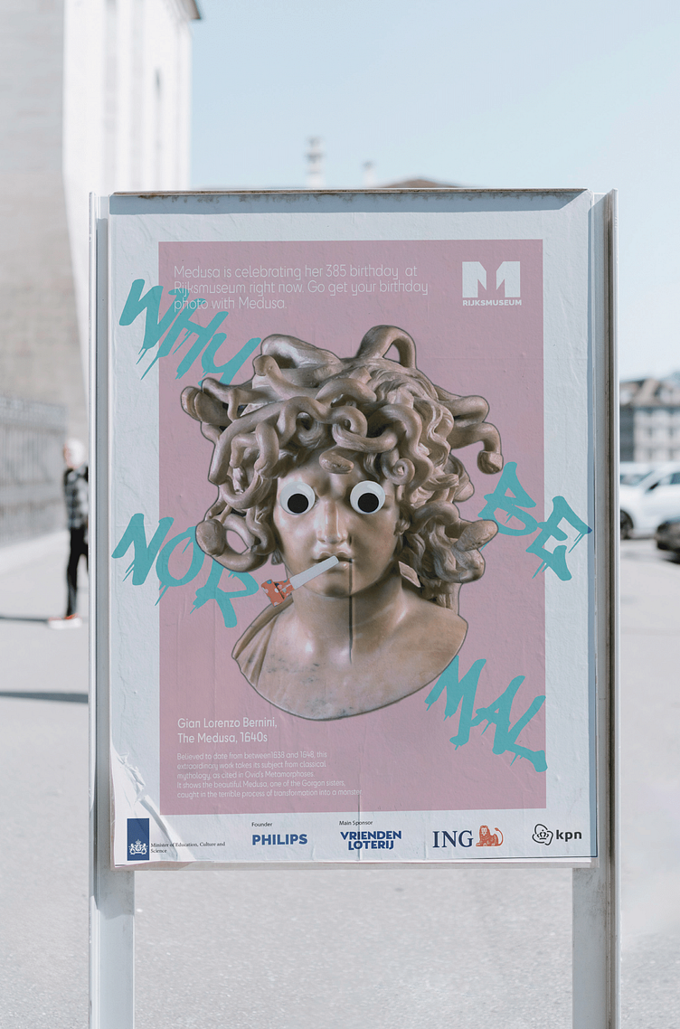
This concept positions the Rijksmuseum as a place where Dutch masterpieces meet modern twists, transforming the museum experience for a younger generation.
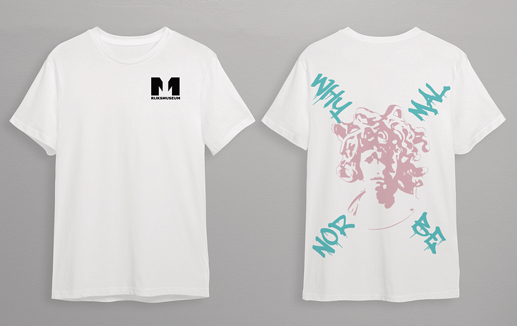
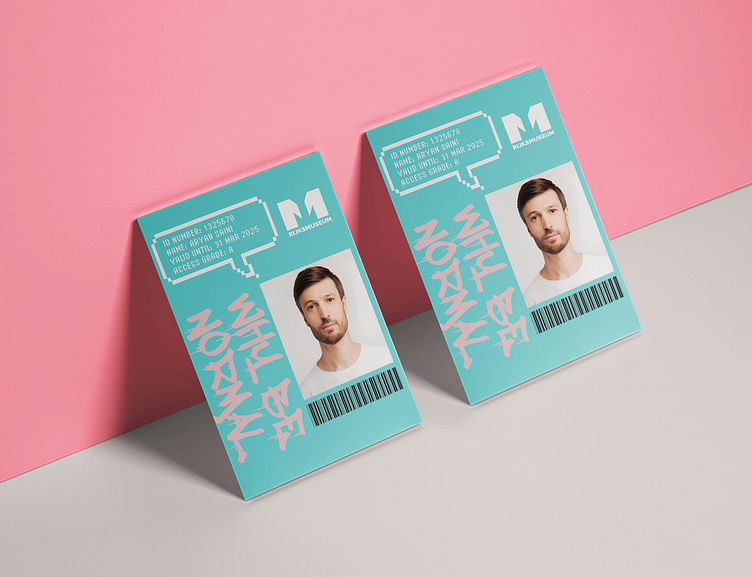
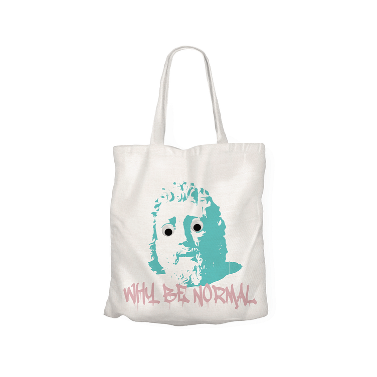
Pop goes the easel: Bold colors, comic-book style graphics, and a playful vibe make the Rijksmuseum feel fresh and inviting, breaking down stereotypes about stuffy museums. The “normal” effect: The tagline “Why be normal?” emphasizes the museum’s relevance. It sparks curiosity by connecting the art to pop culture and social media trends, making it easier for young adults to see themselves reflected in the museum’s collection.
Respecting the classics: The Rijksmuseum pieces stay central to the concept. The core collection and its historical significance remain at the forefront, ensuring existing audiences still feel welcome and valued.
Strategic Framework
A core issue with the branding of the Rijksmusem is developing balance between tradition and innovation. Currently, the brand lacks any sort of elements that project a sense of innovation which would appeal to contemporary, specifically younger audiences. As accessibility is a primary value, it is important for the brand to also cater to the demographic of casual viewers and those between the ages of 18-27. The vision for Riksmuseum is to foster an appreciation for art and history among visitors around the world, from a wide variety of backgrounds. This will be achieved in the rebrand by combining more playful, visually engaging elements with famous artworks to demonstrate the fusion of the old and the new.
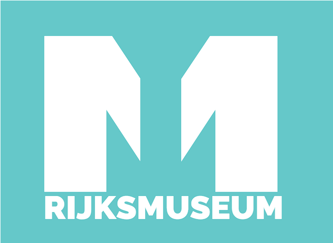
New Logo
The new Rijksmuseum logo is a testament to smart design, seamlessly integrating the museum's architectural elements into the bold "M." This modern visual identity balances strength and accessibility, ensuring broad engagement. The logo captures the museum's iconic facade, connecting past and present, and highlighting the institution's commitment to preserving and celebrating cultural heritage. This blend of contemporary design with historical architecture not only enhances brand recognition but also reinforces the museum's role as a beacon of art and history. Through this reimagined logo, the Rijksmuseum aims to inspire and connect with a diverse, culturally curious audience.