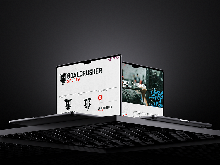
E-Commerce goalcrusher branding
Building a brand for a crusher of goals.
In the world of e-commerce every distinguishing feature of a brand matters. So that's why we went full rebbel with the branding of Goalcrusher.
They had an existing brand identity but weren't able to capitalize on the opportunities offered in their niche. With a strong focus on visual appeal and rough look we've boosted sales about 10% in the first week after launch. The image below was the concept we've made to get a idea of how the brand should feel.
With that concept made and talked trough we started working on a visual style sheet to lock in some of the elements and their placement. Achieving quick but professional results on a tight budget we were able to get all of the needs of our client met.
Sometimes speed has more priority than perfectionism, that has been a strength (pun intended) in our project together with Goalcrusher Sports.
Deliverables:
New revised logo
Style sheet
Concept sheet
E-Commerce listing images
Brand asset development.
Typographic guidelines (mainly for use in images)
Iconography
Interested in partnering with us?
Get in touch at info@graphiclab.nl or visit our website graphiclab.nl.
Follow our updates on:
This project was made in a collaboration with nomadsoffice
info@nomadsoffice.nl | www.nomadsoffice.nl


