:: Sandupa Packaging ::
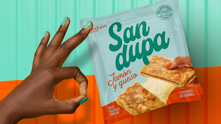
The chosen proposal for this project gave us enough room to play around with color combinations and showcase the variety of the portfolio. The perfect complement was the product name. In this case, it was the same as the brand name, but we needed to make it stand out somehow. So, we decided to split it into two parts to give it more presence and ensure that when it was introduced to its new audience, there would be no doubt about it. The flexible and soft typography fit perfectly with the playful nature of the main ingredient, cheese, and the fun vibe of the brand.
We included an identifiable factor for the audience: a hand grabbing the Sandupa with a tempting and unpretentious grip. Also, the appetizing nature of the product had to be shown on the packaging, just as it is. That’s why stretching its generous and extravagant cheese made our job easier.
The real challenge came with the photo shoot. We had to find the best photography and food styling team to make this as great as we imagined. A designer's job doesn’t end when they design an ideal world on a screen that's hard to bring to life. Luckily, we found the right team, and from the first meeting, we knew they wouldn't wing it. After the shoot, they sent us the processed and cut-out images with the temptation and detail we wanted to reflect on our packaging.
The result left the whole team very satisfied, and now Sandupa is making waves on the streets of Antioquia, getting people talking.