Polygon 2.0 Campaign Design
Polygon 2.0 Campaign Branding
Timeline: <1 Week
At Polygon, we were gearing up to launch our roadmap for the future. This was a significant announcement for Polygon's community, covering reimagined protocol architecture, tokenomics, and governance. The team wanted the visuals for this campaign to evoke a sense of going back to the drawing board, laying the blueprint for the value layer of the new internet.
The Cocept
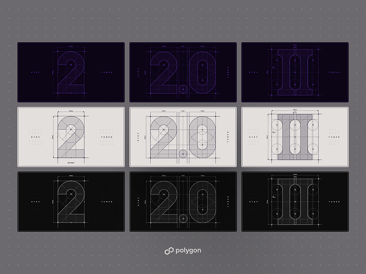
Upon exploring my options and moodboarding, I settled on a blueprint/architecture diagram aesthetic. The team was also on board with this idea. I then created various options to tease the new version of Polygon, i.e., 2.0. I also explored a few color variations that would fit Polygon's brand.
Let's Draw it
To spice things up and make an engaging teaser, I decided to create a drawing animation. This reinforced the idea of going back to the drawing board without giving much away, I chose to animate the Roman numeral II.
While the animation turned out well, it felt like it was missing something. To enhance it, I decided to add another 'dimension'—literally. I created a 3D version of the drawing animation, this time featuring '2.0', the final name for the campaign.
