FLYER DESIGN
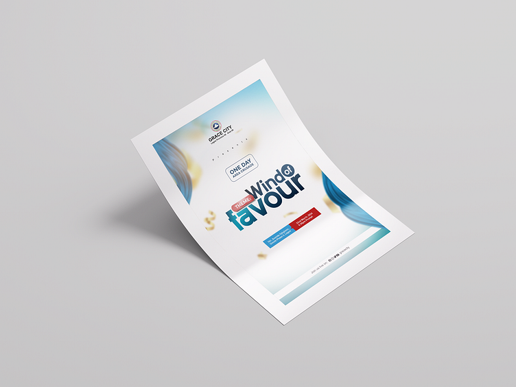
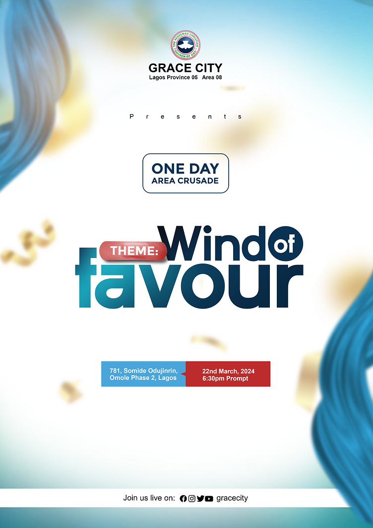
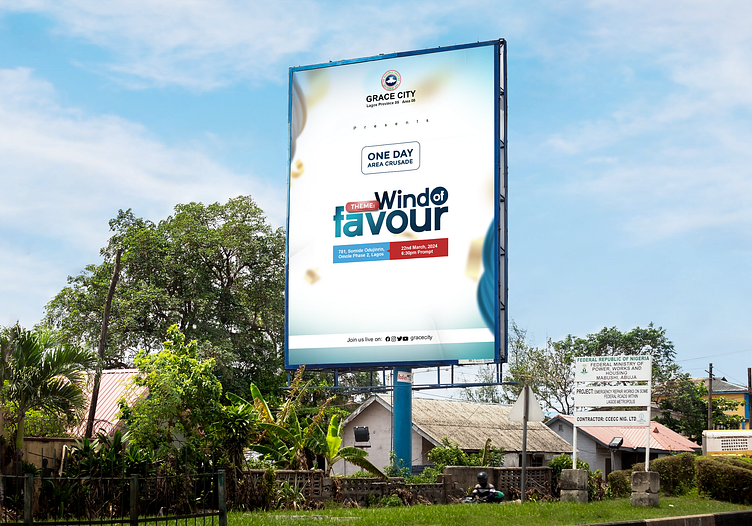
This is a flyer I designed earlier this year for a client who works in a church as the church administrator, he requested something to project the upcoming church revival to its immediate community, "something nice, simple but yet attractive...let it be a shade of blue" he quoted. This is what I came out with
Design Elements:
Layout: The flyer follows a clean, hierarchical layout, with a focus on readability and important details.
Colors: The design predominantly uses shades of blue and white, which are calming and often associated with trust, spirituality, and professionalism. The use of red for the date and time draws attention to critical event information.
Typography: The fonts are modern and bold, ensuring clarity. Different font weights and sizes highlight the event theme, date, and time, making them stand out.
Imagery: The abstract blue elements swirling around the edges suggest the "Wind" theme, creating a sense of movement and divine flow.
Logo and Branding: The Grace City Church logo is prominently displayed at the top, reinforcing the church’s identity.

Thank you for viewing, I will appreciate your feedback.
