Team B Branding and Full Identity
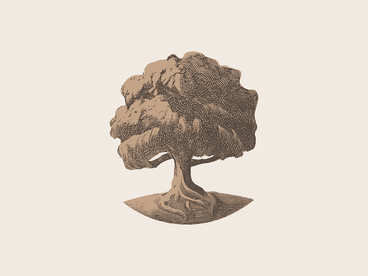
Its been awhile since I've had client that wasn't university related. I had a lot of fun on this one. My client had a good idea of what they wanted to represent them (oak tree) and some great key words to work from such as "local, genuine, trustworthy."
I went with an engraved styling for to give it a sense of sophistication and timelessness and a copperplate-esque type to give the impression of trustworthy and safe.
These are not the colors chosen by the client, but rather the one's I preferred.
I had to make sure to reverse out the tree the one color on dark so that the shading still worked. All in all I'm fairly satisfied with the end result as was the client.
More by Jacob Cotton View profile
Like


