Design of PharmacyRx - A Pharmacy Savings App
Target Audience: Individuals who regularly purchase prescription medications and are looking to save money.
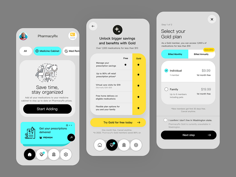
Choose a calming color palette to provide a sense of trust and reliability. I used clean and readable fonts to ensure accessibility for users of all ages.
Feature: Easy navigation to key functionalities such as Medicine Cabinet, Med Reminders, and Prescription Delivery.
Design Elements: Clear, concise call-to-action buttons, visually appealing icons, and a prominent user profile section for personalization.
Gold Membership Benefits:
Feature: Highlighting premium benefits like up to 90% off prescriptions, virtual care, and home delivery.
Design Elements: A comparison table showing the difference between Free and Gold plans, making it easy for users to see the value of upgrading.
Subscription Plans:
Feature: Simplified selection process for choosing between individual and family plans.
Design Elements: Clear pricing, billing options, and a straightforward call-to-action to proceed to the next step.
The design of the PharmacyRx app successfully addressed the needs of its target audience by providing a user-friendly interface, valuable features, and clear cost-saving options. This case study demonstrates the importance of user-centered design in creating effective healthcare solutions.


