High-Converting Corporate Landing Page UX/UI Design
ABOUT THE PROJECT
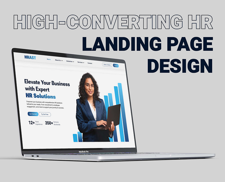
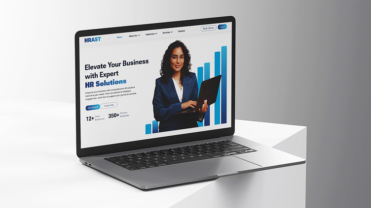
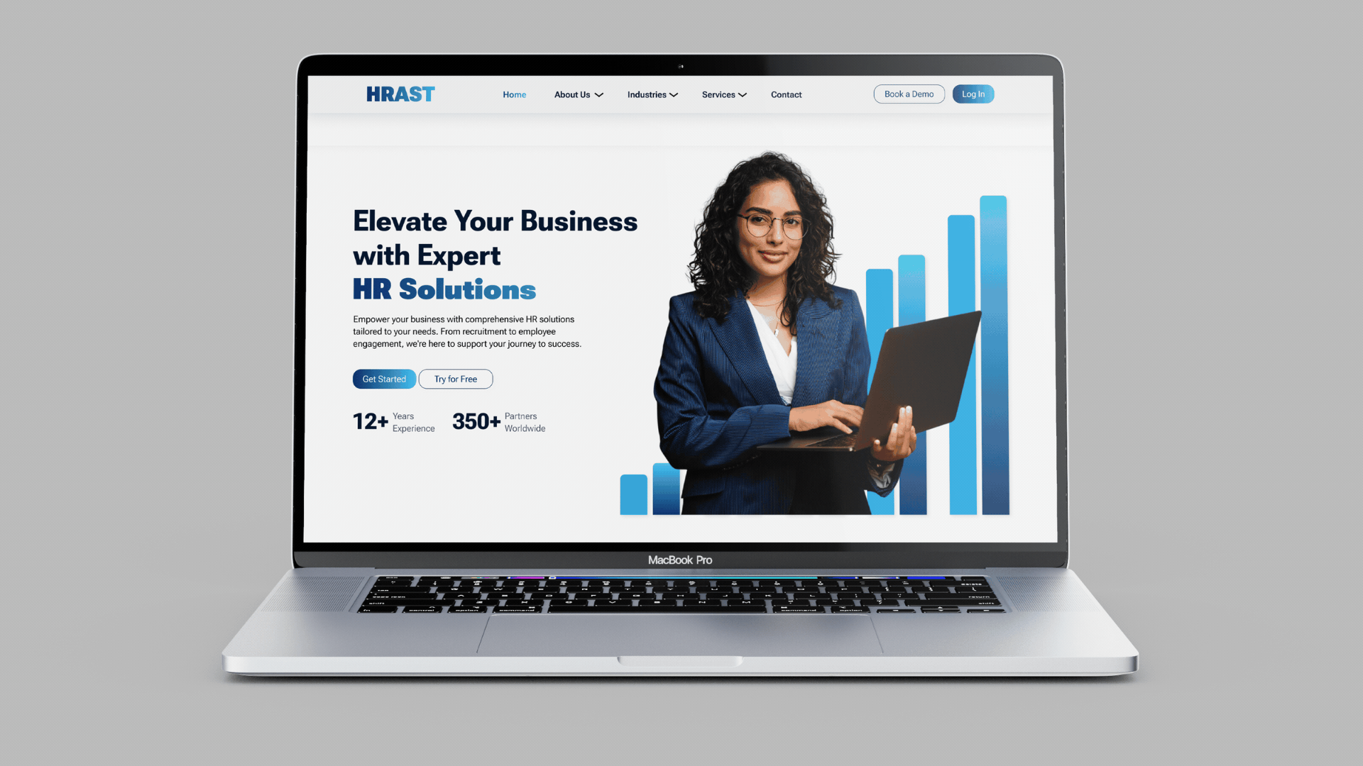
The HRAST landing page project was designed to create a clean, corporate interface that effectively communicates the company's comprehensive HR solutions.
The main objectives were to design a high-converting, user-friendly landing page that enhances the user experience and promotes engagement.
Key goals and objectives included:
Clean, Corporate Design: Ensure the interface looks professional and aligns with HRAST's brand identity.
High Conversion Rates: Create a landing page that encourages visitors to take action and engage with the services offered.
Simplicity and Effectiveness: Design a straightforward and intuitive layout that highlights key information without overwhelming the user.
User-Friendly Interface: Prioritize ease of navigation to enhance the overall user experience.
Engaging Content: Use clear headings, concise text, and compelling call-to-action buttons to guide users seamlessly through the page.
By focusing on these objectives, I aimed to build a landing page that not only attracts potential clients but also converts them into engaged users, ultimately driving business growth and success for HRAST. Each design element was carefully selected to create a cohesive and polished look, ensuring the landing page effectively communicates the value of HRAST's HR solutions.
HOW TO DESIGN A HIGH-CONVERTING LANDING PAGE DESIGN?
Designing a high-converting landing page involves several key elements to ensure that it effectively captures visitors' attention and encourages them to take action.
Here are the essential steps and best practices:
Clear Value Proposition:
Ensure the main headline communicates the primary benefit or value of your service.
Use subheadings to provide additional context and reinforce the value proposition.
Compelling Visuals:
Use high-quality images or graphics that align with your brand and message.
Incorporate visuals that illustrate the benefits of your services.
Strong Call-to-Action (CTA):
Place prominent CTA buttons above the fold and throughout the page.
Use action-oriented language (e.g., "Get Started," "Try for Free," "Start Hiring Today").
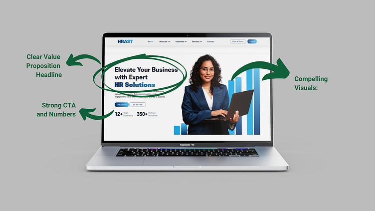
Trust Indicators and Numbers:
Include testimonials, client logos, or case studies to build credibility and trust.
Highlight any industry awards or recognitions.
User-Friendly Layout:
Keep the design clean and uncluttered to avoid overwhelming visitors.
Use a logical flow to guide users through the content, leading them towards the CTA.
Engaging Content:
Write concise and compelling copy that highlights the key benefits and features of your services.
Use bullet points to make information easily scannable.
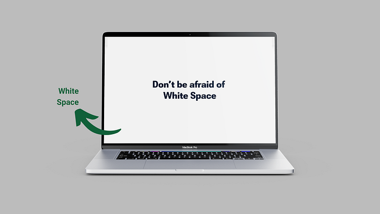
White space helps to:
Enhance Readability and Focus: White space helps break up text and images, making the content easier to read and navigate. It directs users' attention to key elements, improving overall comprehension.
Create a Clean, Professional Look:
Strategic use of white space results in a clean, uncluttered design that enhances visual appeal. It contributes to a more professional and polished appearance, increasing user trust and engagement.
Last, but definitely not least - Consistent Branding:
Use colors, fonts, and design elements that are consistent with your brand identity.
Ensure all elements align with your overall brand message and tone.
By following these best practices, you can design a landing page that effectively captures leads, promotes engagement, and drives conversions, ultimately contributing to the success of your business.
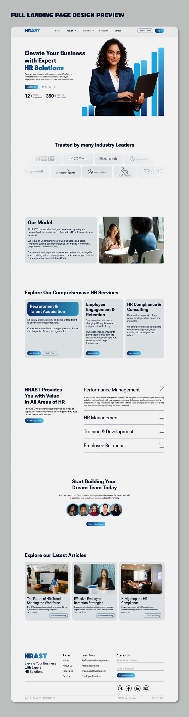
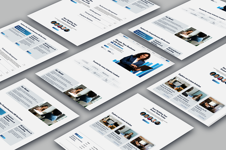
You can find the link to the Full Landing Page here!
THANK YOU
Thank you for taking the time to see and appreciate this project.
E-mail: work@elenapetkovska.com
