Turicarmen App Design - A One-Stop Shop for El Carmen
I'm Mehtab Ali, a UX/UI designer specializing in crafting user-centric mobile applications. This case study delves into the design of Turicarmen, a mobile app that caters to both tourists and local residents of El Carmen de Viboral, Colombia.
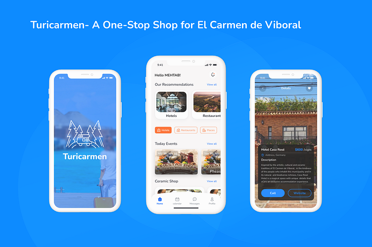
Turicarmen serves as a comprehensive guide, allowing visitors to discover the town's hidden gems and cultural treasures, while empowering locals to explore new offerings and support local businesses, particularly the renowned ceramic shops El Carmen de Viboral is famous for.
Project Challenge:
El Carmen de Viboral, known for its vibrant ceramic artistry and traditional charm, lacked a centralized platform to showcase its offerings to both tourists and locals. The challenge was to design an app that:
Enhances tourist discovery: Provides a user-friendly way for tourists to explore hotels, restaurants, famous landmarks, and unique shops like the town's renowned ceramic stores.
Empowers local residents: Functions as a valuable resource for locals to discover new places, revisit old favorites, and stay informed about local events.
Promotes cultural immersion: Offers content and features that immerse users in the unique character and traditions of El Carmen de Viboral.
Solution:
Turicarmen addresses these needs with the following features:
Curated recommendations: Personalized recommendations for hotels, restaurants, and activities based on user preferences and interests. Also Include more services like Water Delivery at Homes.
Detailed listings: Each listing provides comprehensive information, including descriptions, photos, contact details, and user reviews.
Multilingual support: The app seamlessly switches between Spanish and English to cater to both tourists and locals.
Design Process:
User research: I conducted interviews and surveys with both tourists and locals in El Carmen de Viboral to understand their needs, preferred information sources, and pain points when navigating the town.
Information architecture: A clear and intuitive information structure was developed to allow users to find what they need quickly and efficiently.
Wireframing and prototyping: Low-fidelity wireframes were first created to establish the app's core functionalities, followed by high-fidelity prototypes for usability testing.
Conclusion:
Turicarmen is a mobile app designed to bridge the gap between tourists and locals in El Carmen de Viboral. By providing a user-friendly platform for exploration, discovery, and cultural immersion, Turicarmen empowers users to experience the best that El Carmen de Viboral has to offer.
Typography:
Font family: Nunito (sans-serif) by Google Fonts (https://fonts.google.com/specimen/Nunito)
Headings:
H1: Nunito Bold, 52px (for Logo Text)
H2: Nunito Bold, 24px (for section titles)
H3: Nunito SemiBold, 20px (for subheadings)
Body text: Nunito Regular, 14px (for primary content)
Button text: Nunito SemiBold, 18px (increased weight for emphasis)
Link text: Nunito Regular, 16px (underline on hover for differentiation)
Line height: 1.5 for all body text elements to improve readability.
Color Palette:
Color palette that reflects the vibrant culture and traditional charm of El Carmen de Viboral.
Primary: Blue - #0D6EFD
Accent: Sunny yellow (highlights key elements) - #FF7029
Neutrals: White (#FFFFFF) and a light gray (#FBF9F9) for backgrounds and UI elements.
Visit Figma Link Here
Check out this Design On Figma Here: LINK
Thanks for checking out my case study!
I hope you found the design process and details for the Turicarmen app interesting.
Do you have any questions or feedback on the project?
I'm always eager to learn and improve my design skills.
Most importantly, I'm currently looking for new UI/UX design projects!
If you or anyone you know has a project that needs a passionate and user-centered designer, please don't hesitate to reach out. Here is my Email Address
itsmehtab28@gmail.com
Thanks again for your time!


