LOGO | ODAKO


Digital Marketing
• Logo Tasarım ve Görsel Kimlik
• Logo Design & Brand Identity
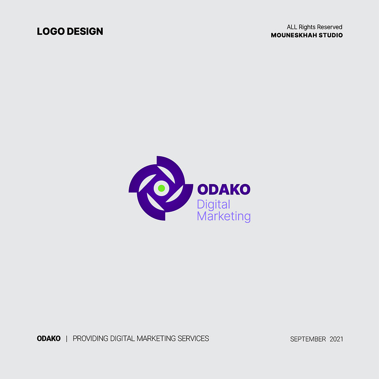
is a digital marketing services company that offers a range of services, including content marketing, email marketing, social media marketing, and digital marketing. The company is a leader in the digital world, creating effective strategies to reach potential and existing customers and establish communication with them.
The logo must be usable in all media and communication tools. Creating attention-grabbing with ambiguity and complexity in logo design usually leads to undesirable effects. A strong logo is better to be clear as well as simple and creates a beautiful and recognizable image of the brand to be identifiable for the target audience.
The ODAKO logo is flexible and compatible with different sizes and dimensions also it is clear, simple, and effective. The logo uses the English letter "O" as the main element, which resembles an eye and signifies precision, attention, and communication. The circle in the logo represents dynamism, growth, and development. The logo's colors are navy and green, with navy as the primary color, indicating deep thinking and stability, while green represents growth, innovation, and trust.
The combination of suitable options in line with the company's field of activity has created a distinctive and attractive logo in harmony with the company's values and objectives.