Fitness Logo Design
Description of the Logo Design
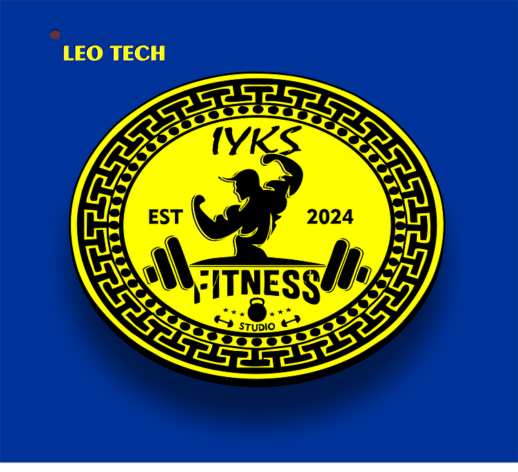
The logo for "IYKS Fitness Studio" is a vibrant and dynamic design that reflects the energy and strength associated with fitness. The primary colors used are yellow and black, which create a striking contrast and ensure high visibility.
Elements and Design Features
1. Central Figure:
- Bodybuilder Silhouette: At the center of the logo, there's a stylized silhouette of a bodybuilder flexing his muscles. This figure is a key element as it directly represents the fitness theme.
2. Text Elements:
- Brand Name (IYKS): Positioned at the top, in a bold and dynamic font.
- Establishment Year (EST 2024): Split into two parts on either side of the bodybuilder, balancing the design.
- Fitness: Placed centrally beneath the bodybuilder, with a barbell graphic integrated into the text to emphasize the fitness theme.
- Studio: Located at the bottom, smaller in size but still clear.
3. Icons and Symbols:
- Barbell: Flanking the word "Fitness" on both sides, reinforcing the focus on strength training.
- Kettlebell: Positioned at the bottom, between the word "Studio" and surrounded by two small dumbbells, adding variety to the fitness equipment depicted.
4. Border and Background:
- Greek Key Pattern: The outer border features a Greek key (meander) pattern, which adds a sense of strength and tradition.
- Dotted Circle: Inside the Greek key border, a dotted circle adds depth and frames the central elements.
- Color Scheme: The background is a bright yellow, while the text and icons are in black, creating a strong visual impact.
5. Additional Text:
- LEO TECH: Appears in the top left corner, suggesting the designer or the brand behind the creation of the logo.
Design Process and Additions
1. Conceptualization:
-Theme Identification: The concept revolves around fitness and strength, leading to the inclusion of the bodybuilder silhouette and gym equipment icons.
-Color Selection: Yellow and black were chosen for their high contrast and energy. Yellow symbolizes energy and positivity, while black adds a sense of power and sophistication.
2. Typography:
-Bold and Dynamic Fonts: Used for the main text elements to convey strength and boldness.
-Custom Elements: The integration of a barbell into the word "Fitness" adds a custom touch that ties the text directly to the fitness theme.
3. Iconography:
-Bodybuilder Silhouette: Created or selected to be instantly recognizable and symbolically powerful.
-Gym Equipment Icons: Added to emphasize the fitness aspect and provide visual interest.
4. Layout and Composition:
- Symmetry and Balance: The design is symmetrical, with elements balanced on either side of the central figure.
-Layering: The Greek key border, dotted circle, and central elements are layered to create depth.
5. Final Touches:
-Color Consistency: Ensuring all elements adhere to the chosen color scheme.
-Clarity and Readability: Adjusting sizes and placements to make sure all text and icons are clear and readable at various sizes. This logo effectively communicates the brand's focus on fitness and strength through its bold imagery and dynamic design elements.
