Projects
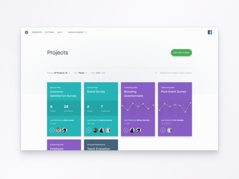
Hope y'all had a great new year! I just recently had the pleasure to take Figma.com for a spin, and rebuilt one of the designs that I did early 2015 for a market research start-up, that tries to automate professional market research.
So far, Figma performs better than expected and handles text surprisingly well - I am looking at you Sketch. I found it also good for designing icons as it comes with a couple of useful tools that I kind of miss in Sketch now.
As for the design, projects fall in three categories, each being colour coded to make it easier for a user to glimpse through her projects. The middle part of a project card is dependent on the phase the project's in, and shows different data accordingly.
Full view is attached.
More by Pascal Gärtner View profile
Like

