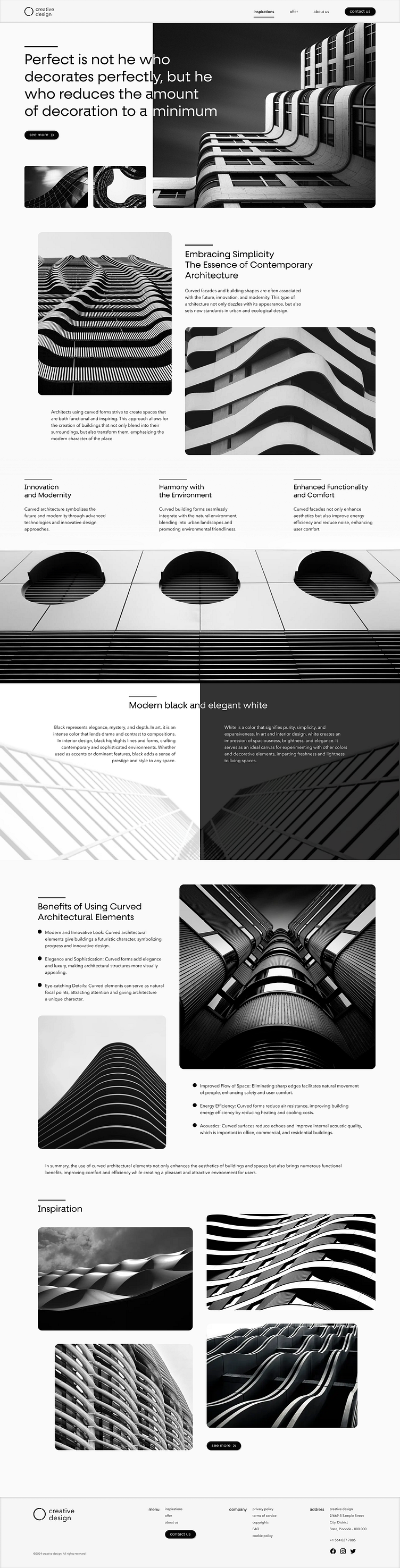
Monochromatic Architecture Subpage
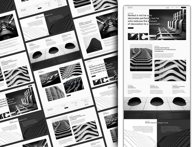
As part of my project, I created a monochromatic subpage dedicated to architecture, which is a part of my portfolio. The main idea of this design was to utilize minimalism and contrast to fully focus the user's attention on the content and visual aspects of the presented architecture.
Design and Colors
The subpage is based on two primary colors: deep black #050505 and pure white #FAFAFA. The contrast of these colors creates an elegant and modern aesthetic that is both attractive and functional. The choice of these colors is not accidental – black symbolizes solidity and modernity, while white adds lightness and spaciousness.
Elements such as texts, dividing lines, and interactive buttons were designed using these two colors, highlighting their importance and facilitating navigation. Every detail has been carefully thought out to ensure visual consistency and intuitive usability.
Footer Background
In contrast, the footer background is kept in a subtle shade of gray #F6F6F6. This delicate color makes the footer less dominant, allowing for a natural conclusion of the page without disturbing the overall impression. It is also a place where additional information and links to other parts of the site are located, while maintaining the aesthetic of the entire project.
Additional Information
Furthermore, I ensured that the page is fully accessible to people with various disabilities. All navigation elements comply with WCAG standards, and the color contrast has been chosen to ensure readability for people with visual impairments.
Additional Information
Furthermore, I ensured that the page is fully accessible to people with various disabilities. All navigation elements comply with WCAG standards, and the color contrast has been chosen to ensure readability for people with visual impairments.
