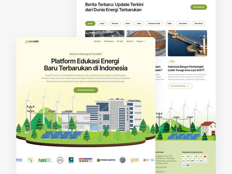
Redesign ZonaEBT Website - Renewable Energy Education Platform
Overview
ZonaEBT is a platform focused on providing information and education about renewable energy in Indonesia. Aiming to raise public awareness on the importance of eco-friendly energy, ZonaEBT offers articles, news, and analyses on developments in renewable energy such as solar, wind, hydro, and bioenergy. Additionally, the platform serves as a hub for discussion and collaboration among professionals, academics, and the general public, promoting the acceleration of the energy transition towards a greener and more sustainable future in Indonesia.
Problem
Overly Simple UI Design: The old design of the ZonaEBT Website has an overly simple appearance without engaging or eye-catching visual elements.
Absence of a Hero Section: One of the main shortcomings of the old design is the absence of a Hero section that highlights the main message or grabs the user's attention when they first visit the site.
Repetitive Content Explaining Features: There is redundant content across different parts of the site, which confuses users and makes the site appear disorganized and unprofessional.
Non-Responsive Sections: Several sections of the site are not responsive, resulting in broken layouts and poor user experience on mobile devices or smaller screens.
Wireframe
After defining the problem and finding a solution, I created a wireframe to design the layout of the new website display. This stage also involved gathering ideas. Below is the wireframe of the new design that will be created:
Hifi Design
What did I change?
Using a sleek and contemporary design, incorporating relevant illustrations and images that align with the website's content and theme.
Integrating a Hero Section and implementing engaging copywriting to pique the audience's curiosity and encourage them to explore the website further.
Employing a more laid-back tone in the copywriting to create a friendly atmosphere and avoid sounding overly formal.
The repetition in the partnership section is purposeful, aiming to enhance the perception of professionalism and cultivate trust among the audience.
Including a CTA section to prompt and remind visitors to join zonaebt.com.
Full Preview
Thanks for checking out my Dribbble shot!
Your feedback and support mean the world to me. Stay inspired, and let's continue this creative journey together.
Let's turn creativity into collaboration!
Excited to explore new possibilities together. Reach out, let's make magic happen!
Contact Me:
amaariz.project@gmail.com
Follow Me For the Latest Updates :


