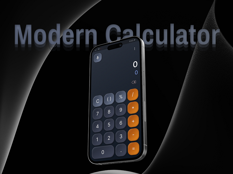
Modern Calculator UI Design
I tackled the task of designing a user-friendly standard calculator app for mobiles. The goal was to create an intuitive and efficient tool for basic arithmetic operations, incorporating modern UI trends and advanced functionalities.
Here’s a detailed breakdown of my design process and the final outcome.
a). Neumorphism UI Buttons: I implemented neumorphic design principles to craft the calculator buttons. This design approach gives the buttons a modern, 3D look that mimics real-life interactions. The subtle shadows and highlights create a soft, tactile feel, making the user experience more engaging and interactive.
b). Dark Bluish Gradient Theme: The app features a sophisticated dark bluish gradient theme, which is visually pleasing and reduces eye strain. This color scheme enhances the app's modern aesthetic while ensuring it remains functional in various lighting conditions.
c). Prominent Display Area: Ensuring the display area is prominent and easily readable was a priority. I used high-contrast typography to differentiate between user input and results. The display dynamically adjusts its size to accommodate larger numbers and complex equations, ensuring clarity and readability.
d). Clear and Legible Typography: For the buttons and display, I chose fonts known for their clarity and readability. The button labels are large and bold, facilitating quick identification and interaction. The display text uses a complementary font, ensuring a cohesive and clear presentation of information.
• Consistency in Design Elements: Consistency was key in my design. I maintained uniform button shapes, sizes, and spacing, ensuring a harmonious visual experience and predictable user interactions.
• Behance Profile: https://lnkd.in/gBP_mMtt
• LinkedIn Profile: https://lnkd.in/gBniH5Wn
• Portfolio Link: https://bento.me/vswastik
• Interactive Prototype: https://lnkd.in/geavCCH8
