LILISA BEAUTY SPA | LOGO DESIGN & BRAND IDENTITY
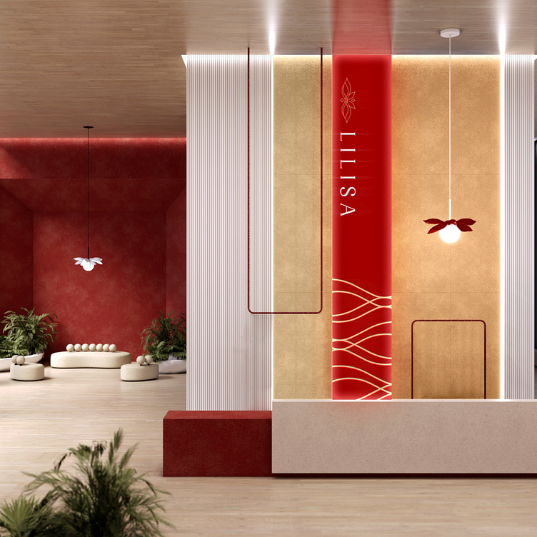
With the mission of bringing the most comprehensive and sophisticated beauty care to customers, LilLiSa is committed to providing relaxing and re-energizing experiences, helping customers not only shine from the outside but also feel relaxed and confident from the inside.
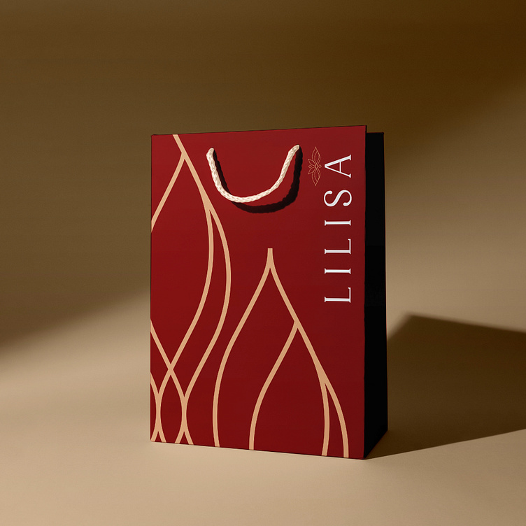
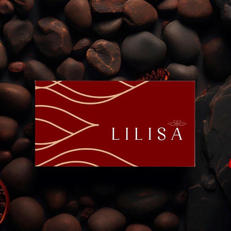
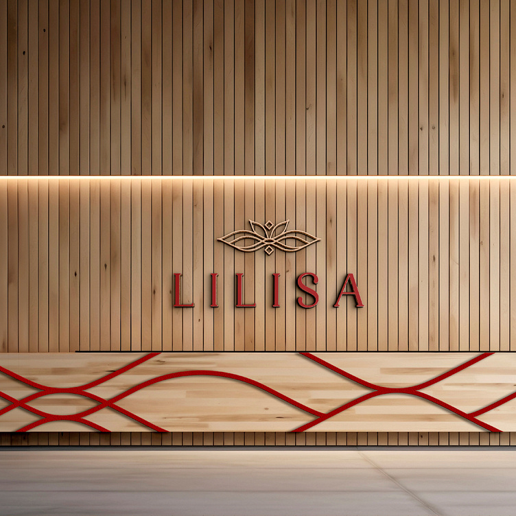
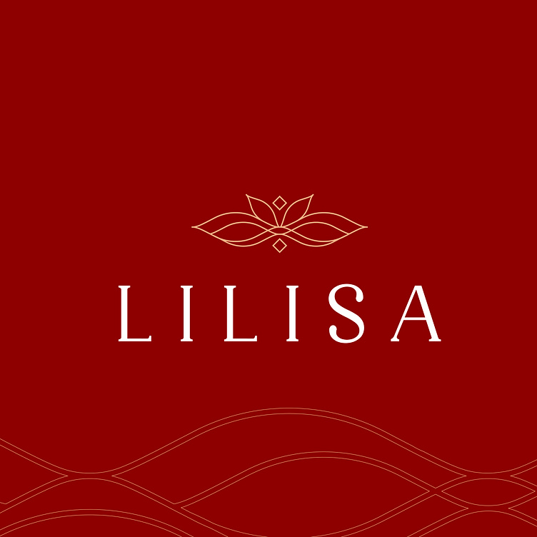
The LiLiSa brand identity is designed based on the criteria of luxury, sophistication but still modern and trendy.
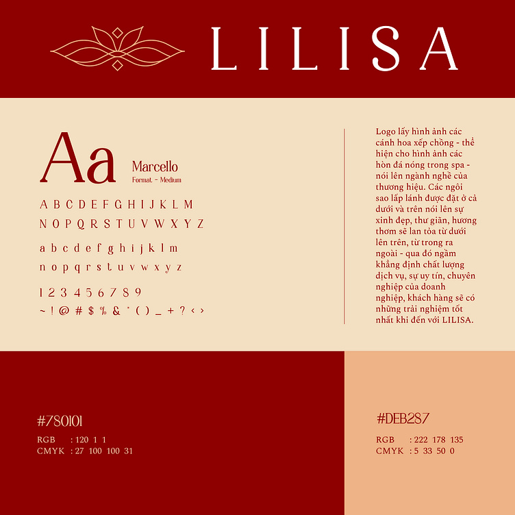
LiLiSa's logo design uses the image of stacked flower petals - representing the image of hot stones in a spa - which speaks to the brand's industry. The sparkling stars placed on both the bottom and the top speak of beauty, relaxation, the fragrance will spread from the bottom to the top, from the inside out - thereby implicitly affirming the service quality, prestige and professionalism of the business, customers will have the best experience when coming to LILISA.
The two colors of red and light yellow coordinate harmoniously, not only bringing an aesthetic and attractive image but also conveying the core values of the spa. This combination helps Lilisa create a luxurious, friendly, and energetic beauty space, providing customers with wonderful and unforgettable beauty experiences.
Designed by Bee Art
-
Client LiliSa Beauty Spa
Logo and Branding Project. Logo is designed for a beauty spa.
Copyright © Bee Art. All Right Reserved
Contact us:
• Hotline/ Zalo: (+84) 77 34567 18
• Email: info@beeart.vn
• Website: www.beeart.vn
• Facebook: https://www.facebook.com/BeeArt.vn