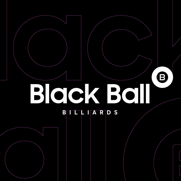
BLACK BALL BILLIARDS | LOGO DESIGN & BRAND IDENTITY
Black Ball Billiards believes that billiards is not only a sport, but also a way to connect people and strives to provide customers with the best pool experience.
Based on that spirit, Bee Art has chosen a minimalist design style with two main tones, black and white, but still breaking the way with prominent pink tones. If black creates elegance, class, and professionalism, while white helps create contrast and highlight other elements, bringing clarity and ease of sight, pink represents prominence and creativity. This reflects the youthful, dynamic and creative spirit of Black Ball Billiards, always innovating to bring exciting experiences to customers.
The logo is designed in a legless font that creates a modern and readable look. This style offers a modern, neat, and professional feel, which is suitable for an entertainment brand. The image of a billiard ball shows the brand's business. The letter "B" around the circle not only represents the Black Ball brand name, but also creates a cohesive and complete image.
Designed by Bee Art
-
Client Black Ball Billiards
Logo Design Project. Packaging is designed for Billiards in Vietnam.
Copyright© Bee Art. All Right Reserved
Contact us:
• Hotline/ Zalo: (+84) 77 34567 18
• Email: info@beeart.vn
• Website: www.beeart.vn
• Facebook: https://www.facebook.com/BeeArt.vn


