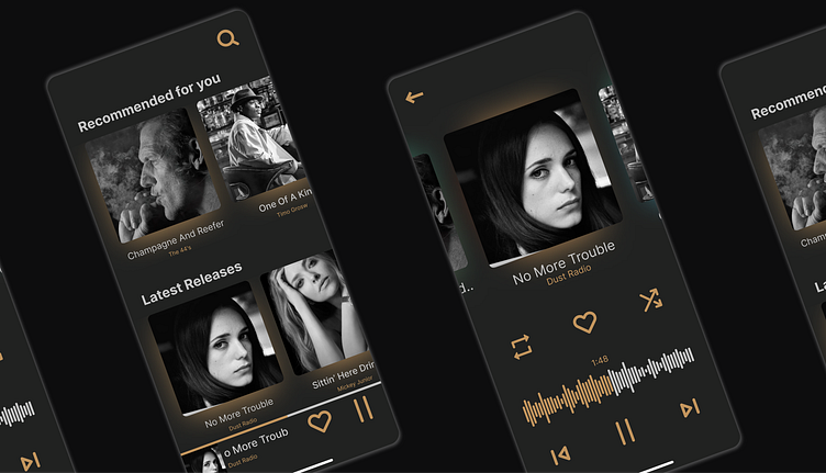
Simple Player
I recently felt inspired to design a simple music player. This is mainly due to my ongoing frustration with the horrible design choices Spotify is making and the insanely un-linear and confusion user flows. Sure, this player doesn't have most of the features Spotify offers, but lets be honest: Whats a feature worth if its overlooked and badly implemented and therefore un-useable without getting frustrated? Really: The Jam feature in Spotify could be great, but there is so much wrong with it, most people don't even know about it! A great testimony to bad UX.
More by Lasse Haupt View profile
Like
