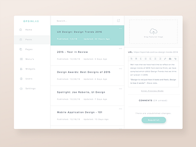
CMS Design - Admin View
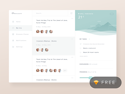
So this morning one of my favorite UI Designers posted a free .Sketch mockup to download (@Ghani Pradita.) I downloaded it, and poked around at the file structure, and compared it to my typical structure (just for learning purposes). While looking at the design, I instantly fell in love with the simple-elegant color palette, but felt that the "columns" were unbalanced in design. So I started to dig in, and restructure the design into a "CMS" design, while balancing the columns in a fashion I think balanced the design better.
Either way, I cannot give enough credit to @Ghani Pradita for the free Sketch resource, and allowing us to see the insides of his incredible designs.
Let me know what you guys think!
Press "L" to show some encouragement!
More by Joe Roberto View profile
Like


