Kingdom Of White
Overview
Primary objective is to introduce two additional categories on our platform, necessitating Information Architecture (IA) changes on the current website. Additionally, we aim to enhance the overall website performance by reducing bounce rates, increasing engagement time, and improving conversion rates through a user-centric design approach.
Key Metrics (Last 4 Months: 10th January 2024 to 8th April 2024)
Home Page
Visitors: 35,523
Avg. Session Duration: 2:17
Bounce Rate: 41%
Conversion Rate: 1.44%
Product Listing Screen
Visitors: 2,84,685
Added to cart: 20,526
Avg. Session Duration: 00:00:47
Bounce Rate: 60%
Conversion Rate: 0.79%
Product Detail Screen
Added to cart: 19,934
Avg. Session Duration: 00:00:34
Bounce Rate: 77.92%
Conversion Rate: 0.74%
I've taken a comprehensive approach, starting with:
Desk Research: Analyzing strategies employed by 14 competitor brands to address similar challenges. Access Document
Typeface Research: Assessing readability challenges and identifying fonts suitable for our users. Access Document
Current Website Behaviour:
Scroll Depth:
98% of users reach the first fold.
74% of users scroll to the second fold.
17% of users reach the third fold.
13% of users reach the fourth fold.
Only 7% of users scroll down to the footer.
Heatmap:
The hamburger menu is highly interacted with by the majority of users.
The search icon attracts 52.81% of users' clicks.
The top offer section garners clicks from 0.55% of users.
0.63% of users click on the WhatsApp support option.
4.94% of users interact with the content in the second fold section.
The new arrival section receives clicks from 0.30% of users.
The discover by occasion section captures clicks from 0.08% of users.1.10% of users engage with the footer, which includes store locator, franchise, and blogs.
User Research Objectives & Approach
To analyse user pain points during the purchasing process on our platform, as well as to understand the specific information they seek while shopping online. Furthermore, investigate the factors contributing to abandoned carts and incomplete transactions, and identify opportunities for improving the overall user experience and conversion rates.
Qualitative User Interview
Competitor Benchmarking
Target Cohort
Loyal Users: These are individuals who have consistently engaged with your brand over a period of time. They frequently purchase your products, actively participate in promotions. They represent a valuable segment of your customer base as they contribute to your brand's stability and growth.
Abandoned Cart Users: This cohort comprises individuals who have shown interest in your products by adding items to their shopping cart but did not complete the purchase. Understanding their behavior can help identify potential barriers in the checkout process or any other issues that might deter them from completing the purchase. Engaging with this cohort can involve targeted reminders, personalized offers, or addressing any concerns they might have.
Dropped-off Users: These are users who were once active customers but have ceased engaging with your brand. They might have stopped visiting your website, interacting with your emails, or making purchases altogether. Understanding the reasons behind their disengagement can provide insights into areas where your brand may need improvement or where you could potentially re-engage them through targeted campaigns or incentives.
Recently Purchased Users: This cohort consists of individuals who have made a purchase from your brand within a specific time frame, typically recent enough to still be considered active customers. Understanding their purchasing behavior, preferences, and satisfaction levels can help tailor marketing efforts to encourage repeat purchases and foster long-term loyalty.
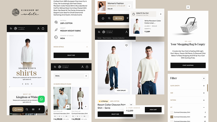
Changes Implemented for Better User Experience:
Home Page:
Reworked Overall IA for multiple entry points.
Enhanced Accessibility of search and category sections via bottom navigation.
Introduced About Brand and Vision sections to foster trust and engagement.
Added Content to Commerce section for improved engagement.
Enhanced visibility of store locator.
Category Landing Screen:
Introduced New Category Landing Section for quicker conversions.
Added multiple entry points such as shop by occasion, shop under 999, shop by fabric for easier navigation.
PLP Screen:
Improved Filter Visibility.
Included Size Chart visibility on Product Cart to reduce drop-offs.
Enhanced product visibility on a single viewport.
PDP Screen:
Enhanced Overall IA of the PDP screen.
Added educational content for informed decision-making.
Introduced multiple variant selection functionality.
Cart Screen:
Added Offers Functionality.
Included nudges for Upsell opportunities.
Enjoy, share some love, and stay awesome! 😷✋🚀
