Spontivly - Data Dashboard Builder
Overview
In 2023, I worked as a Senior Product Designer with Spontivly, a venture-backed startup democratizing data dashboards. I designed a platform allowing non-technical users to create custom dashboards without needing an engineer, helping teams make better, data-driven decisions.
Highlights
Led website redesign, increasing website sales leads
Created Figma prototypes for sales demos to accelerate our sales cycle
Designed a multi-tenant platform that supports data from 120+ integrations
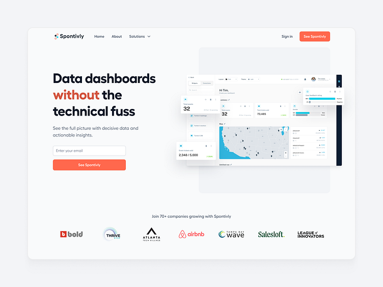
Website Redesign
My first project at Spontivly was redesigning the marketing website to create a more consistent message and visual language. I collaborated closely with the marketing team and presented concepts to stakeholders, ensuring the new design aligned with the company’s ethos. By advocating for an accessible CMS, I enabled anyone in the company to manage content like blog posts. I led the development and hired some of my engineering contacts, and we successfully launched the new site over a month ahead of schedule.
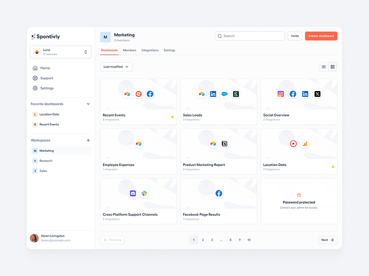
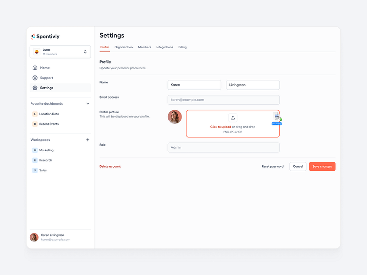
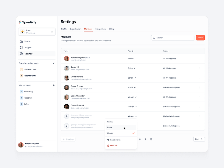
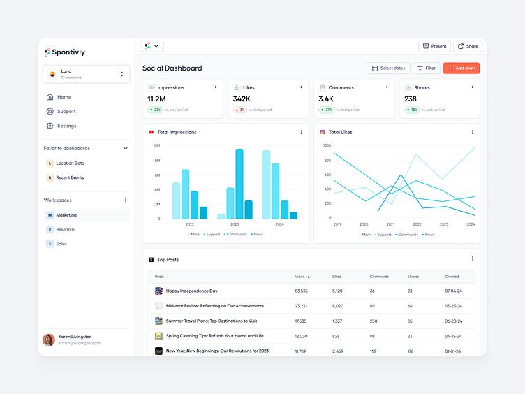
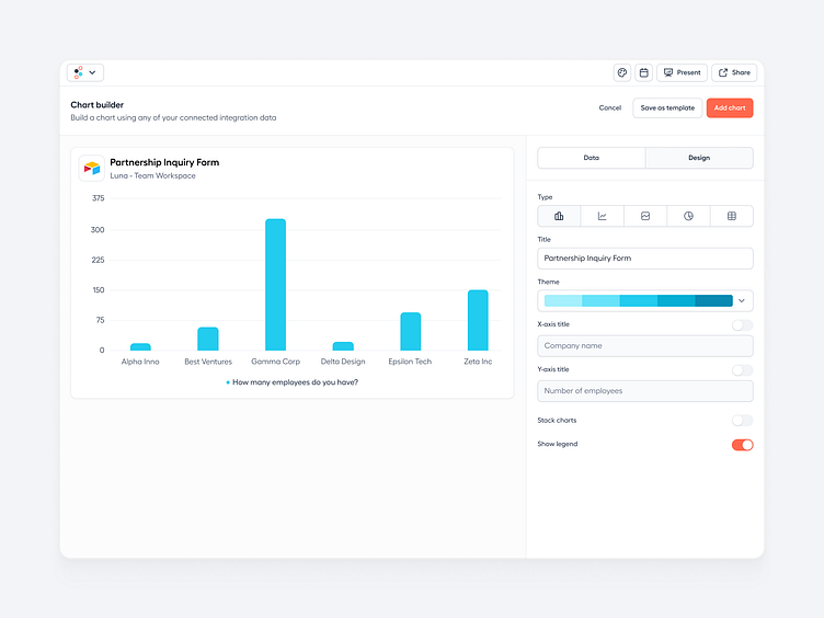
Dashboard Builder
I led the design of the data dashboard builder and an admin dashboard for managing user-created dashboards and permissions. The goal was to enable users to connect any API from social media, CRMs, and more and customize the generated charts and tables in a drag-and-drop builder. I collaborated closely with marketing, engineering, and co-founders to understand our users and their varied goals, from providing stakeholder reports to making data-driven decisions. I tried to steer the design toward something that felt familiar while still incorporating all of the features that make Spontivly a unique platform for data analysis.
Insights
This experience taught me a lot about designing data visualization and how crucial it is to balance a product’s complexity to satisfy advanced users without scaring off newcomers. At Spontivly, we struck that balance, leading to noteworthy teams from various industries becoming users.
My key takeaway is that introducing complex features should be done strategically: prioritize the most relevant features and push advanced options further into the background while still keeping them within reach. This approach enhances usability for all skill levels and drives deeper engagement and adoption among mixed user groups.
Let’s connect!