App Tudor
Hey there, folks! 👋 So, I've been tinkering away at this sleek new UI concept for a Tudor mobile store, and I couldn't wait to give you all a peek! ⌚️
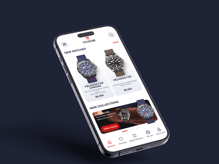
🔍 Find Your Perfect Match
Ever spent ages hunting for that one watch that speaks to your soul? Well, worry no more! This app streamlines the search process, making it a breeze to discover the Tudor timepiece that perfectly complements your style.
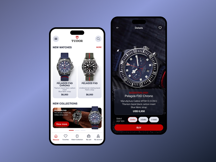
🛒 Seamless Shopping Experience
Once you've found "the one," snagging it is as easy as a tap and a swipe. With a smooth and intuitive interface, browsing through our collection and making a purchase is a joy, not a chore.
Colors
In this proposal, I've curated a design palette tailored to Tudor's brand identity:
Dark Blue: Reflects trust and reliability, enhancing contrast for a seamless browsing experience.
Red: Evokes Tudor's energy and passion, reserved for key elements like call-to-action buttons.
White: Provides a clean backdrop, ensuring readability and balance throughout the interface.
Helvetica Neue Font: Modern and elegant, aligning with Tudor's sophistication and simplicity.
Each element is meticulously selected to create a visually appealing and user-friendly e-commerce app that resonates with Tudor's core values.⌚️

So, what do you think?
Give it a whirl and let me know your thoughts in the comments below! Thanks, y'all! 🙌...
Follow me on Instagram: Jonathan Buitrago
