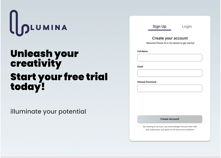
Sign-Up Page UI Concept
Sharing my clean and minimal sign-up page UI concept for an online learning platform. This single-page design focuses on guiding new users through the registration process effortlessly.
Design Process
Wireframing: I created low-fidelity wireframe to establish the basic layout and structure of the sign-up form.
Minimalist Layout: The split layout creates a balanced composition, allocating ample space for both engaging marketing copy and a concise sign-up form.
Calming Colors: A soft gradient background using #CFD9DF and #E2EBF0 evokes a peaceful and focused learning environment. The use of dark gray (#333333) text on the white form ensures readability and contrast.
Clear Typography: Poppins (bold) is used for headlines, while Open Sans (regular) is used for body text, creating a clear hierarchy and aiding readability.
Goal
My aim was to design a visually pleasing and functional sign-up page that seamlessly guides users through the registration process.


