Clearstream Logo
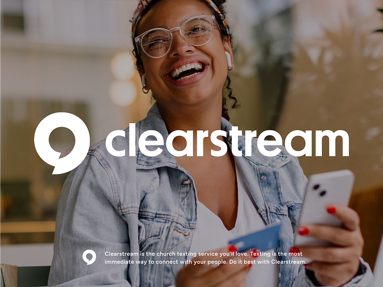
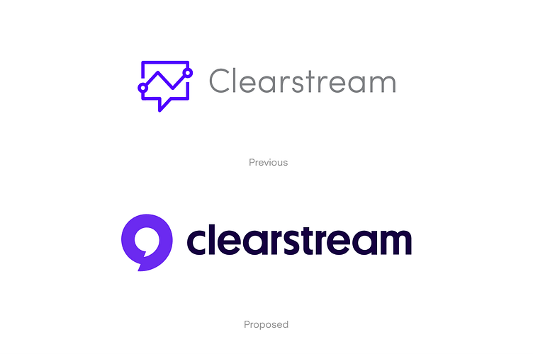
Clearstream came to Heyo with a problem. They had pivoted from their previous business model of providing churches assistance live streaming services to a text service app to help congregations connect with each other. Their previous logo did not reflect who they were and needed a refresh. One of our main objectives was for the logo was to provide clarity and be direct...
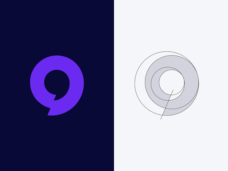
In order to accomplish this we focused on the chat bubble as a visual cue. The challenge of the project was to take a universal symbol and make it ownable for Clearstream. We landed on this simple, thick-lined, bold version that accomplished all the goals we had laid out.
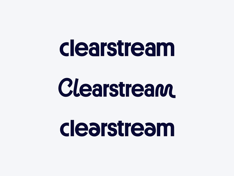
Another thing we identified with their previous logo was the need to add clarity and distinctiveness to the logotype. Using Platform as the base type, we explored different ways to infuse some playfulness and add more meaning with the letterforms.
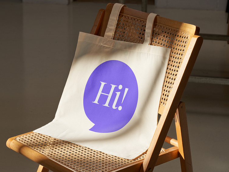
The simplicity of the mark allowed us to use it in broad ways through out the rest of the visual identity.
What do you think?
✌️Do you have a project in mind? We’d love to hear about it. Get in touch here!