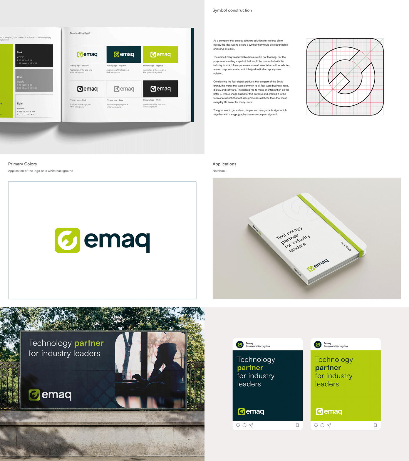
Emaq Design Process
Client: Emaq
Services: Visual Identity, Brand Support
Year: 2024
Design: Sanjin Halilovic
ABOUT COMPANY
Emaq is an innovator in digital transformation and a technological ally of industry leaders, committed to creating efficient solutions that enhance business culture.
With its years of experience, Emaq has developed over 20 digital products for its clients, shaping their businesses worldwide through education and the implementation of digitization strategies.
A team of over 50 experts is synonymous with quality and results, with products that solve challenges on a global level, making Emaq a key player in the evolution of modern enterprises.
VISUAL IDENTITY CONCEPT
As a company that creates software solutions for various client needs, the idea was to create a symbol that would be recognizable and serve as a link. The name Emaq was favorable because it is not too long. For the purpose of creating a symbol that would be connected with the industry in which Emaq operates, a small association with words, i.e., a mind map, was made, which helped to find an appropriate solution. Considering the four digital products that are part of the Emaq brand, the words that were common to all four were business, tools, digital, and software. This helped me to make an intervention on the letter E, whose shape I used for this purpose and created it in the form of a wrench that actually symbolizes all these tools that make everyday life easier for many users. The goal was to get a clean, simple, and recognizable sign, which together with the typography creates a compact sign unit.


