Snack packaging design
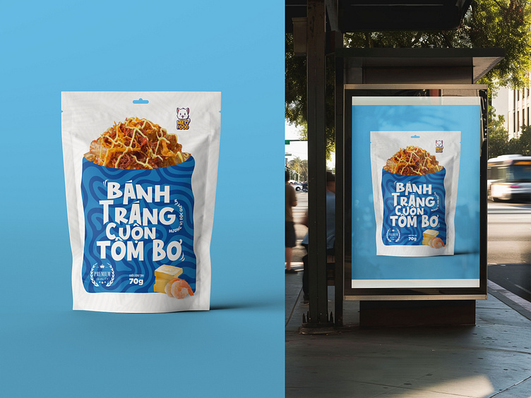
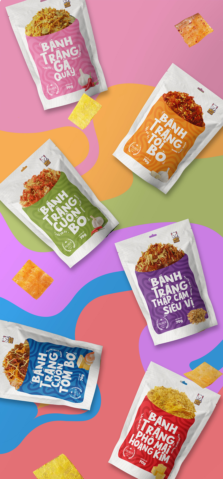
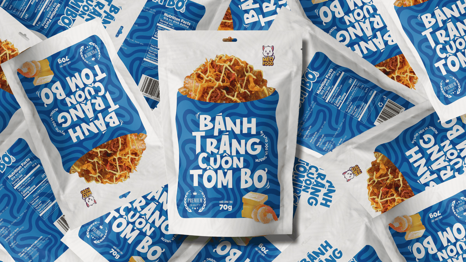
For this collaboration, we chose a youthful and modern design style, tailored to the young demographic, to create packaging that is distinctive and easily recognizable. Regarding the packaging form, we used a stand-up pouch with a convenient zipper, which helps preserve the product after opening. The packaging has a rectangular shape with rounded corners, providing a soft and easy-to-hold feel.
The product name features a playful and youthful twist using the Goham font, characterized by thick and clear strokes. This, combined with detailed illustrations of key ingredients like cheese, garlic, beef, chicken, and shrimp, creates a youthful, modern design that captures the attention of consumers.
Click here to view detail!!!

Project: Snack packaging
Category: Packaging
Client: Meo Food Co.
Designer: Nguyễn Hoàng Tấn Tài
Team: May design – Thiet ke co tam
----
Let's connect:
Mây Design | Dribbble | Instagram / Pinterest
We're available for new projects!
Tell us more at maydesign.thietkecotam@gmail.com
