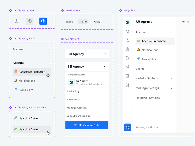
Crisp - CRM Modular Navigation
Hey hey,
Sharing our approach to designing a modular navigation for the Crisp CRM platform. Utilizing atomic design principles, the layout is structured into distinct levels and units, ensuring intuitive and efficient user navigation. From level 1 units to detailed dropdown items, each component is crafted to enhance user experience and accessibility.
Founded in 2015 by a small group of enthusiasts in Nantes, France, Crisp is now used by over 200,000 brands worldwide. Providing a unique, human-centered experience for small and medium-sized businesses (SMBs) — bringing together teams, conversations, data, and knowledge all in one place.
The redesigned CRM platform captures Crisp’s essence in a unified, minimalist interface that prioritizes user needs. Our thorough research, including competitive analysis and site analytics, informed our design choices.
Our focus was on decluttering the user experience and design, making the platform more intuitive for users and easier to maintain for the Crisp team. Every little detail was carefully crafted to balance aesthetic appeal with practical functionality.
Explore the case study here ➡️ https://bb.agency/project/crisp
We are BB Agency
We are a partner for digital evolution, merging creativity and technology for holistic growth.
We join forces with companies dedicated to addressing real human needs. Leveraging our full-cycle digital capabilities, we shape brands, experiences, and products that enrich the lives of millions every single day.
Check us out at www.bb.agency


