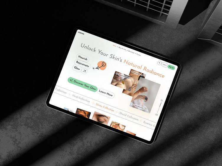
Skin Care Website Landing UI Design
🌟 Unlock Your Skin's Natural Radiance: A Skincare Website Concept 🌟
Hey Dribbble friends!
I'm thrilled to share with you the finished part of my latest project: a sleek and soothing skincare website design for LOCAS. This concept focuses on simplicity, elegance, and user-friendly navigation to help users discover the best in skincare products.
✨ Key Features:
Minimalistic Design: Clean lines and ample white space for a modern, refreshing look.
Soft Color Palette: A gentle blend of whites and warm tones to evoke a sense of calm and natural beauty.
Engaging Imagery: High-quality visuals that highlight the essence of skincare and self-care.
Interactive Elements: Intuitive buttons and calls to action to guide users effortlessly through the site.
🖌️ Design Details:
Typography: A mix of modern, sans-serif fonts that ensure readability and add a contemporary flair.
Color Scheme: A soothing palette with a pop of orange to draw attention to key areas, symbolizing radiance and vitality.
User Experience: Thoughtfully placed buttons like “Discover Your Glow” and “Learn More” to encourage exploration and engagement.
Navigation: Simple and straightforward with options for Home, New Arrivals, Download, and Pricing. The Log In and Sign Up buttons are easily accessible for a seamless user journey.
🔍 Highlights:
Nourish, Rejuvenate, Glow: These core values are emphasized through interactive buttons that guide the user’s experience.
Responsive Design: Optimized for both desktop and mobile to ensure a smooth experience on any device.
Accessibility: Designed with accessibility in mind to make sure everyone can enjoy the site.
let me know what you think! Your feedback is incredibly valuable as I continue to refine and perfect this concept.
Thanks for checking it out! 🙌
Feel free to adjust or expand upon this as needed. The goal is to showcase your design in an engaging, friendly, and professional manner that highlights the key features and thought process behind the project.

