Costa Refresh - App Concept
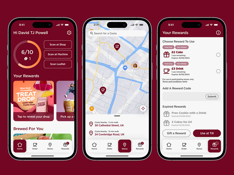
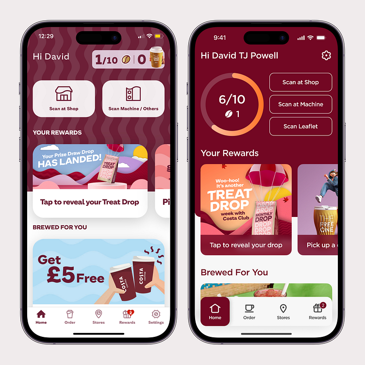
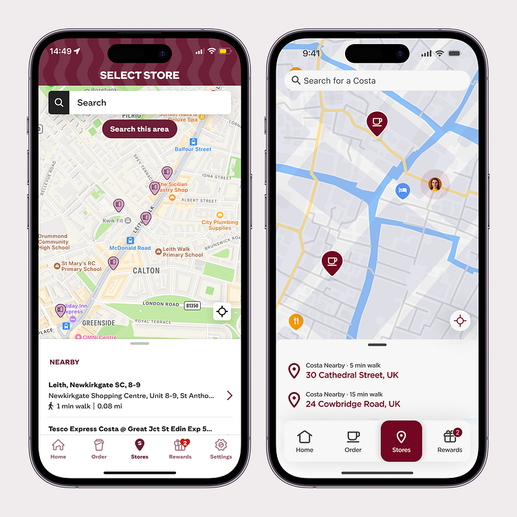
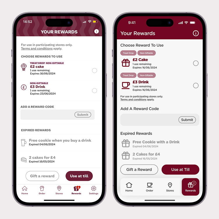
What if we gave the Costa app a boost by returning to its roots? Imagine bringing back that Mulberry Wood Red as the dominant colour in the app.
Here's why I prefer it:
☕️ It's beautifully bold
☕️ It's fragrantly fresh
☕️ It's high contrast
Further changes to simplify could include:
✨ Bigger titles for legibility
✨ Simplify the navigation
✨ Bring Settings up by name
✨ 3 scan buttons instead of 2
✨ Visual purchase progress
🤩 And more
Enjoy!