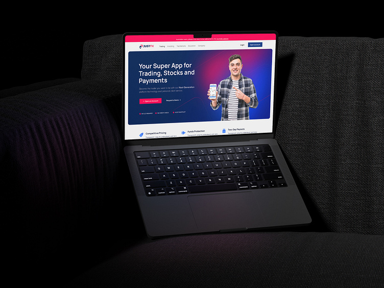
Just Forex Website Design & Brand Identity
Category: Website Design | Branding | Forex Brokerage.
Client: Just FX (Link On text : (https://justfxmarkets.com )
Design Challenge:
Just FX, a forward-thinking forex broker, sought a website and brand identity that defied industry standards. They needed a design that conveyed innovation, accessibility, and a dynamic approach to trading.
Our Approach:
Drawing on our experience in forex web design, we embarked on a journey to:
Craft a Unique Brand Identity: We developed a distinct visual language for Just FX, including a custom logo, color palette, and brand patterns that set them apart. (Mention the specific color scheme used if it's particularly unique, e.g., "vibrant gradient" or "bold contrasting colors").
Build a User-Friendly Experience: Clear navigation, intuitive layouts, and engaging content made the website easy and enjoyable to navigate for traders of all levels.
Embrace Innovation: We incorporated cutting-edge design elements to reflect Just FX's commitment to a modern and dynamic trading experience.
The Result:
A visually striking website and brand identity that perfectly embodies Just FX's unique value proposition. The design stands out in the crowded forex market, attracting both seasoned traders and those new to the world of currency exchange.


