LOGO | LAVAMINS
Jewelry
• Logo Tasarım ve Görsel Kimlik
• Logo Design & Brand Identity
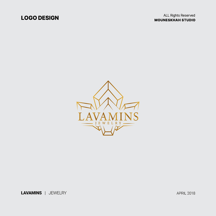
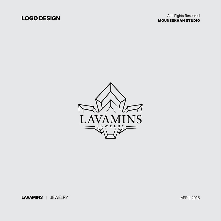
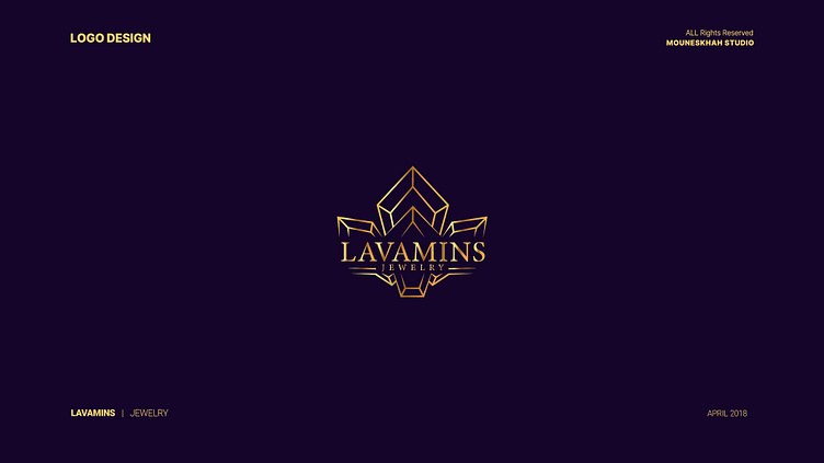
The LAVAMINS brand is involved in the buying and selling of jewelry. In designing the brand's logo, graphic tools, and colors have been used proportionally to create an attractive and unique identity.
The monogram of the brand name LAVAMINS creates a direct connection with the brand. The logo's center features the shape of four precious stones (jewels), indicating the beauty and attractiveness of jewelry. This imagery is in line with the brand's field of activity, which is luxury jewelry. The gold color symbolizes value and wealth. Because this color shows the highest quality and standard and is also a sign of luxury. In the LAVAMINS logo, the aim is to create emotions and a deep connection with the brand's field of activity by combining graphic elements. The logo represents the beauty, credibility, and value of the brand in its field of activity and directly connects it to jewelry and precious stones.
Overall, the LAVAMINS logo, with its chosen colors, shapes, and patterns, not only attracts the attention of target customers but also professionally represents the brand's identity. This beautiful and simple logo is easily recognizable and memorable for the target audience.