Spotify - As I Would Want It (Personally)


Happy New Year Everyone!
Over the past couple of weeks I have decided to slowly take a stab at designing elements of Spotify as how I would want to see it and use it. Being a recent convert from Rdio (a far superior product), I really struggle to enjoy Spotify. Although it has some performance improvements over Rdio, it is not something I truly enjoy to look at or use. Being that I never really get the chance to sit down and design for recreation, I decided to take this on.
DISCLAIMER: In no way do I intend to disrespect the hard work the Spotify team has poured into their product. They know the biz goals, their users, and have sat in the trenches of how and why they designed the way they did. So, hats off! At the end of the day, it still plays music (very well) I love for a very reasonable price.
The Design:
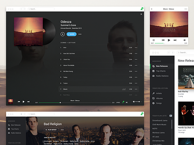
This is a design of how I would personally want MY SPOTIFY to look and feel.
Now, I know before you even say it, “This looks a ton like Rdio!” Yes, I know. I loved Rdio. They nailed it. They designed the product so well and it was so easy to use! Had they done a better job at marketing and offered a free ad supported level for their customers prior to 3 years ago, they would probably still be around.
One of my biggest struggles with Spotify is getting to my albums from the Artist level. Spotify requires me to see all the artists albums in a song list format and play (everything) from there. Sometimes I don’t want to list to every song by that artist. Sometimes I just want a particular album. Its a pain getting to that point. If there is an easier way and I just have not discovered it, it still fails…because I have not discovered it. I fixed this by allowing the user to go to their artists and see all the albums they have and drill in from the artist’s album list in order to play songs. I still left the functionality of playing everything though.
The over emphasis of playlists and friends feels like a giant distraction competing for my attention. It does not seem primary, yet Spotify seems to push that to me. They do however, allow me to customize my view. But I think that’s weird. I removed this and feel that this information can be structured more in a 3 part navigation:
-New Releases
-Top Charts
-Radio Stations
If it's discoverability that Spotify is after, I think it can still be achieved in this manner.
I also think Spotify needs a mini player. I like minimizing items like this and anchoring it to my screen somewhere while working. Apple’s iTunes has done a great job at this feature.
Another point of improvement is focus on the artist and albums and not all the noise surrounding artists and albums. It seems these secondary bits of information can be removed and put into submenu upon click/hover. (Did not spend a ton of design time on this but removed menu items)
Lastly, the dark UI. I really dislike this aspect of Spotify. Let’s reserve dark UI’s for television. I don’t mind a dark element here and there, but this it too much.
Well, go rip me apart. Go tell me what you love. There are tons of elements I did not design. But some key elements and themed screens I did design. I plan to go back and revisit the mobile (iOS) product and do the same. I feel its even more of a struggle for me than the desktop app.
#makeitbetter
Again, HUGE props to Spotify and their hard work. It’s a great product.
Thanks for checking this out! Be sure to see the prototype I did with InVision as well as the attachments.