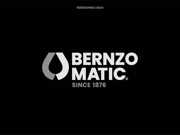
Bernzomatic Logo Redesign Concept
The redesigned logo for Bernzo Matic is crafted to embody the core essence and identity of the brand while introducing modern elements that enhance its visual appeal and functionality.
The new design retains the legacy and recognizability of the Bernzo Matic name, ensuring continuity and familiarity for existing customers. At the same time, it incorporates contemporary design elements that reflect the brand's evolution and commitment to innovation.
The logo utilizes clean, bold lines and a streamlined font to convey a sense of strength and precision, which are hallmarks of Bernzo Matic's products. The design also incorporates subtle geometric shapes that suggest tools and instruments, reinforcing the brand's association with high-quality, reliable products used in various applications, from industrial to DIY projects.
Incorporating a visual element that symbolizes the brand’s industry, such as a stylized flame or spark, further emphasizes Bernzo Matic's expertise in producing torches and related equipment. This element is carefully integrated to complement the text, ensuring a cohesive and balanced look.
The color palette is chosen to reflect trustworthiness and professionalism, with shades that evoke the heat and energy associated with Bernzo Matic's products. The use of contrasting colors ensures the logo stands out in various contexts, whether on packaging, digital platforms, or promotional materials.
Overall, the redesigned logo maintains the heritage of Bernzo Matic while positioning it firmly in the modern era. It communicates the brand's dedication to quality, innovation, and reliability, making it instantly recognizable and resonant with both longstanding and new customers. #logoredesign #logodesign #logo


