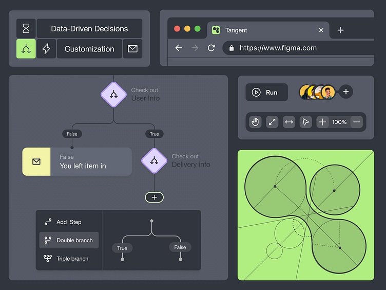
Tangent: Clean & Efficient UI for Streamlined Automation Tool
This Dribble shot dives into Tangent's user interface (UI), designed for a clean and efficient user experience. The focus is on:
Clear Icons: Simple and intuitive icons for easy navigation and recognition of communication channels (SMS, Email, Pop-Ups) and workflow elements.
Sophisticated Logo: A sleek and memorable logo that reflects Tangent's brand identity.
Visual Workflow Builder: Drag-and-drop elements and clear visual cues for building automated communication workflows effortlessly.
Grey & Green Color Scheme: A professional and modern color palette (grey) with pops of green to highlight key actions and create a visually appealing interface.
💥 www.glow.team 💥
More by Glow - UI/UX Design Agency View profile
Like
