Moustache Gracias - Mexican Taco Restaurant
Hey Dribbblers!
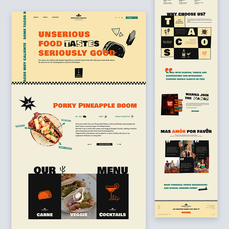
Today, I’m thrilled to share my latest case study design, the homepage for "Moustache Gracias," a trendy Mexican taco restaurant! This place isn't just about tacos; Moustache Gracias is the go-to spot for fun gatherings.
The homepage is packed with impactful and quirky visuals, bringing the essence of Mexican culture to life. I’ve used iconic colors—orange, green, and beige—to capture the rich and festive spirit. A dark coffee hue adds contrast and character, making key information pop.
The design not only awakens curiosity but also makes your mouth water for tacos. It’s inviting, warm, and festive—exactly what you’d expect from a top-tier taco joint.
Rumor has it you get discount if you go up there with a sombrero.
Let’s taco ‘bout it! Do you guys like it?
Any thoughts on this? Eager to read them where they belong!
Still not following me?
Here is the link to make your day better @weare_wildstudio
Thanks a million for your support and feedback.
Stay green, cheers! 🌲
