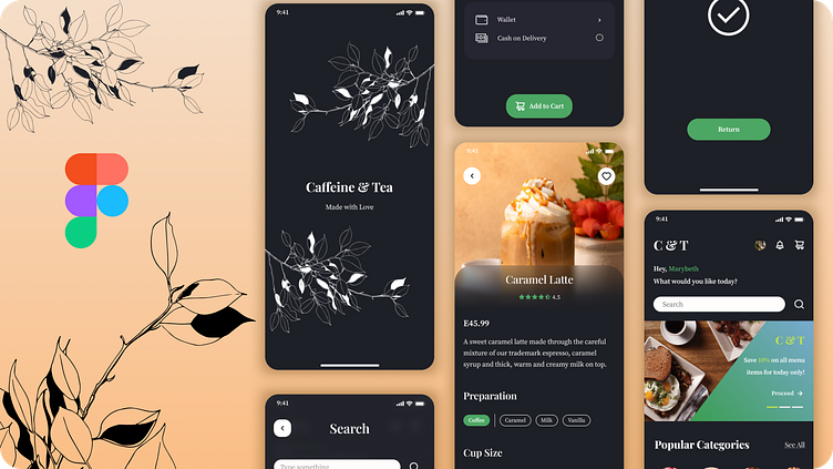
Cofee And Tea ui design
The UI design focuses on creating an intuitive and visually appealing interface that allows users to easily access and interact with key data and insights. The design combines functionality with aesthetics to enhance user experience and productivity. Key features of the dashboard UI design include:
Clean and Modern Aesthetics:
The design incorporates a clean and modern aesthetic with a minimalistic approach, utilizing ample white space, balanced layouts, and a cohesive color scheme.
High-contrast colors and typography ensure readability and visual hierarchy, directing users' attention to important elements.
User-Centric Navigation:
A well-organized navigation system is implemented, featuring a sidebar or top navigation bar for easy access to different sections and functionalities.
Interactive elements such as dropdown menus, tooltips, and hover effects provide a seamless navigation experience.
Data Visualization:
The dashboard utilizes various data visualization techniques, including charts, graphs, and infographics, to present complex data in an easily digestible format.
Interactive elements like filter options and drill-down capabilities allow users to explore data at different levels of detail.
Customizability:
Users can personalize their dashboard experience by customizing widgets, arranging them to suit their preferences, and saving these configurations for future use.
The design supports various data sources and integration options, allowing users to tailor the dashboard to their specific needs.
Responsive Design:
The dashboard is designed to be fully responsive, ensuring a consistent and optimal experience across all devices, including desktops, tablets, and smartphones.
Adaptive layouts and scalable elements maintain usability and accessibility regardless of screen size.
Real-Time Data Updates:
Real-time data updates ensure that users have access to the most current information, with visual indicators highlighting changes and trends.
Automatic refresh capabilities and notification systems keep users informed of critical updates and alerts.
User Feedback and Interaction:
Interactive features such as drag-and-drop functionality, in-line editing, and contextual actions allow users to engage directly with the data.
Feedback mechanisms, including success messages, error alerts, and loading indicators, enhance the user experience by providing clear communication.
Accessibility and Usability:
The design adheres to accessibility standards, ensuring that the dashboard is usable by individuals with disabilities.
Keyboard navigation, screen reader compatibility, and color contrast considerations are integrated to provide an inclusive user experience.
Overall, the dashboard UI design aims to provide a user-friendly, efficient, and visually appealing platform for users to interact with and derive insights from their data.
4o
