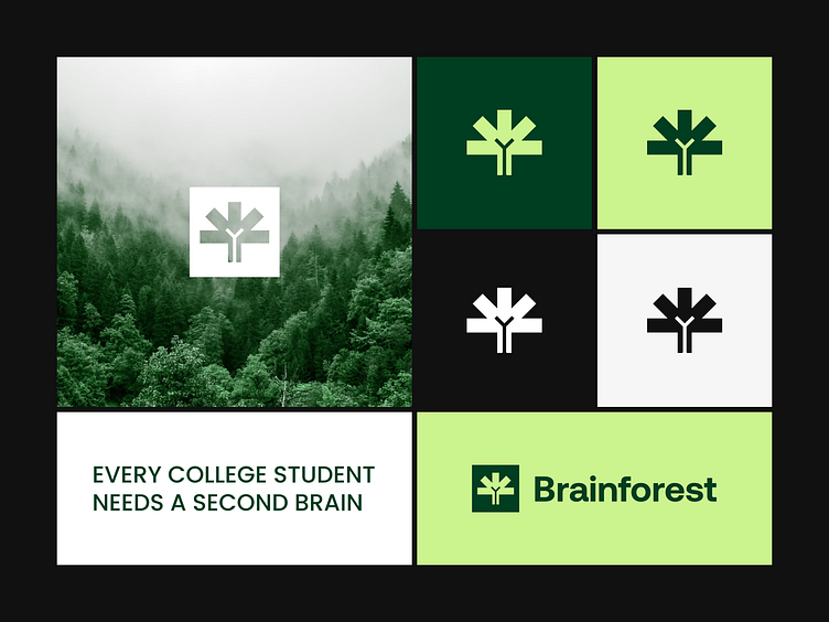
Brainforest - Logo & brand identity for the educational platform
Brainforest: Where Knowledge Grows
At Outcrowd, we are excited to unveil the brand identity for Brainforest, an innovative educational platform that fosters intellectual and creative growth.
A Logo That Grows With You
The Brainforest logo is a representation of the platform's core concept. It features a schematic brain cleverly illustrated to resemble a tree.
The tree branches symbolize the development and expansion of intellectual potential, perfectly aligning with Brainforest's mission.
Colors Inspired by Nature
The color palette reflects Brainforest's connection to learning and growth.
Lime green energizes the design, representing the active learning process. Forest green and dark green hues evoke a sense of nature, reinforcing the idea of organic development.
Black adds contrast and sophistication, while white and light gray provide a touch of modernity and transparency
A Brand Identity That Inspires
Brainforest's logo and color palette combine to create a recognizable and inspiring brand identity.
This identity is not just visually appealing; it embodies the very essence of Brainforest's mission – to cultivate knowledge and empower intellectual growth.
hello@outcrowd.io
outcrowd.io
Make sure your brand image won't get lost in the market noise.
With design and branding, Outcrowd helps to reveal the essence of your brand and transform it into a powerful force that excels in results.
Become a part of Outcrowd communities:


