Just Eat Iconography
Epic Food Delivery on a Global Scale 🛵
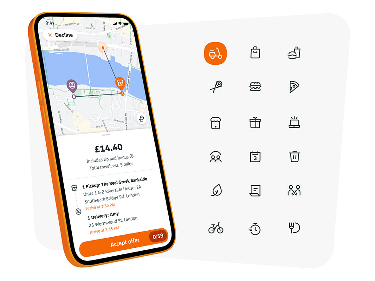
Just Eat is the king of takeout and delivery in Europe and other Eastern countries. They reached out to develop a custom icon system that was built upon their brand voice and branded typeface. We created 100+ custom and consistent ui icons for their app and marketing website, along with a style guide that outlines the icon's recipe for consistency.
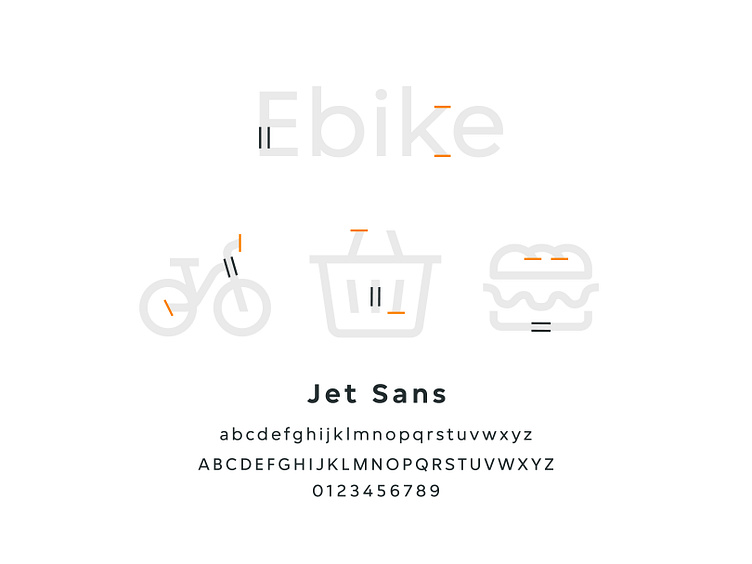
Icons + Typography, A Perfect Match
We used the bold geometric lines, signature curves, and cutoff endpoints to inspire the shapes and style of the icon system. That way the typography is visually tied to the icons in a beautiful way.
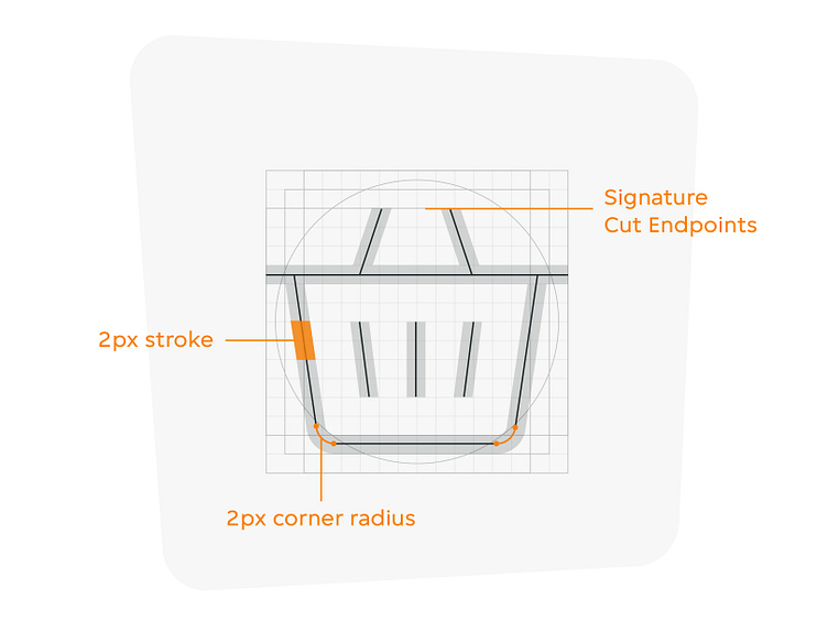
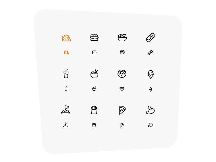
Multi-Tiered Icons - Responsively Responsible
Because of the varying use cases for the icons within the UI, the team wanted to develop 2 different sizes with subtle detail changes as the icons downsize to become more legible and simple at the smaller size.
_________________________________________________________________________________
Want to build custom icons for your brand? ✨
Shoot me a message! 📧
I'll respond within a few hours with a custom quote and proposal.