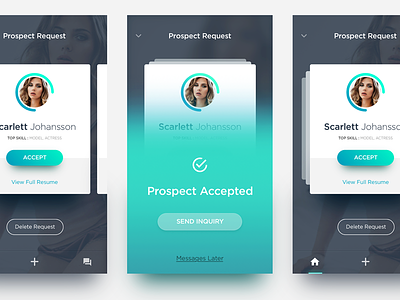
iOS Profile Card Style
Long time didn't take some practice for GIF's and this time try to play with some profile card version, stuck for some interaction and transition for while.
Hope i got some feedback for you about how it would be and decide which card is better. Then from your vote and any opinion i will try to make them to GIF's. Please check the @2x too. Can't wait to see you in comment :D
Hint : The middle one is state when user tap on accept button :')
More by Azís Pradana View profile
Like
