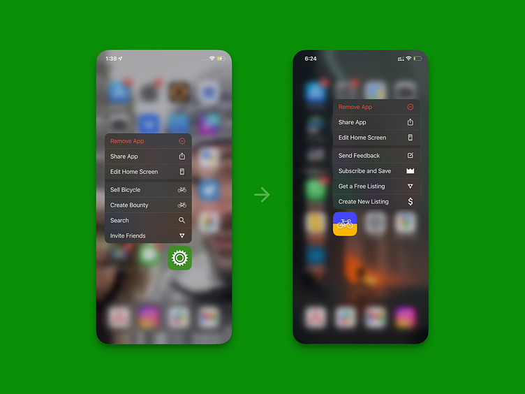
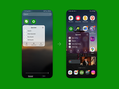
Sprocket iOS App Icon Shortcut Optimization
Because I realized through data-analysis that my app ( as many other apps ) has ~30% of its installers never open it - the quick menu became an even more important space. I changed the menu to highlight an opportunty to check out our subscriptions as well as give us feedback if you were considering to uninstall Sprocket. Lastly I updated the referral and sale creation icons/text to make them more clear and user-friendly :)
If you like it, don't hesitate to click "L" 💗 or "F" + "Follow"
👇 Follow us and get the app now + review us 🌟
Sprocket Bicycle App on Android
Sprocket Bicycle Blog on Instagram
Sprocket Bicycle Blog on Threads
Sprocket Bicycle Blog on YouTube
Sprocket Bicycle Blog on Tumblr
Sprocket Bicycle Blog on Facebook
Sprocket Bicycle Blog on Product Hunt
Sprocket Bicycle Blog on Blue Sky
Hi-Fi specs used to design this UI update and document the changes in our team master blueprint


